ROC-AUC Curve in Machine Learning
Let's cut straight to the core. The ROC-AUC curve is one of the most widely used evaluation metrics in binary classification, and for good reason. It measures a classifier's ability to distinguish between classes across all possible decision thresholds -- not just the default 0.5 cutoff most beginners assume is gospel.
ROC stands for Receiver Operating Characteristic, a term inherited from signal detection theory developed in the 1950s during World War II radar research. AUC is the Area Under the Curve -- a single scalar that summarizes the entire ROC curve into one interpretable number ranging from 0.5 (random guessing) to 1.0 (perfect separation).
Here's what makes ROC-AUC special: it's threshold-independent. While metrics like precision, recall, and F1 score depend on where you draw the line between positive and negative predictions, ROC-AUC evaluates your model's ranking ability across all possible thresholds. This makes it invaluable when you need to compare models without committing to a specific operating point upfront.
Today, you'll find ROC-AUC everywhere -- from fraud detection systems at ICICI Bank identifying suspicious transactions, to medical diagnosis models at Apollo Hospitals flagging potential cancer cases, to credit scoring algorithms at HDFC determining loan approvals. If a system ranks candidates by probability and needs to separate sheep from goats, ROC-AUC is probably in the evaluation pipeline.
But -- and this is critical -- ROC-AUC is not a silver bullet. It has blind spots, particularly with severely imbalanced datasets where the positive class is rare. That's exactly why understanding not just how to calculate it, but when to trust it and when to reach for alternatives like precision-recall curves, separates practitioners who ship robust systems from those who chase vanity metrics.
Concept Snapshot
- What It Is
- A visualization and summary metric that plots True Positive Rate against False Positive Rate at every classification threshold, with AUC quantifying the overall ability of a binary classifier to discriminate between classes.
- Category
- Evaluation
- Complexity
- Intermediate
- Inputs / Outputs
- Inputs: predicted probabilities (or scores) and ground truth binary labels. Outputs: ROC curve plot (TPR vs FPR) and AUC score (scalar between 0.5 and 1.0).
- System Placement
- Applied during model evaluation after training, before deployment. Also used during hyperparameter tuning and A/B testing to compare candidate models.
- Also Known As
- AUC-ROC, AUROC, Area Under the ROC Curve, Receiver Operating Characteristic curve, C-statistic (in medical literature), Concordance index
- Typical Users
- Data scientists, ML engineers, Medical researchers, Risk analysts, Fraud detection teams
- Prerequisites
- Binary classification, Confusion matrix (TP, FP, TN, FN), Probability predictions vs. hard labels, Sensitivity and specificity
- Key Terms
- TPR (True Positive Rate)FPR (False Positive Rate)AUC (Area Under Curve)thresholdYouden's J statisticmulti-class OvR/OvOmacro/micro averagingGini coefficientpartial AUC
Why This Concept Exists
The Decision Threshold Dilemma
Most binary classifiers don't output hard 0/1 predictions -- they output probabilities or scores. A logistic regression might predict 0.73 for one sample and 0.12 for another. To get actual class predictions, you need to pick a decision threshold: "If probability > 0.5, predict positive; otherwise, predict negative."
But why 0.5? That's arbitrary. For a spam filter, you might want threshold = 0.9 to avoid false positives (legitimate emails in spam). For a cancer screening test, you might want threshold = 0.2 to avoid false negatives (missing actual cancer cases). The optimal threshold depends entirely on the business context and the relative costs of different error types.
The Problem with Threshold-Dependent Metrics
Metrics like accuracy, precision, recall, and F1 score all depend on the threshold you choose. If you evaluate a model at threshold = 0.5 and get F1 = 0.82, that tells you nothing about performance at threshold = 0.3 or 0.7. When comparing two models, Model A might win at one threshold while Model B wins at another.
This creates a fundamental question: How do you evaluate and compare classifiers without committing to a specific threshold?
Enter the ROC Curve
The ROC curve solves this by showing you the trade-off between True Positive Rate (TPR, also called sensitivity or recall) and False Positive Rate (FPR) at every possible threshold. It's a comprehensive view of your classifier's discriminative ability.
The AUC reduces this entire curve to a single number: the probability that your model ranks a randomly chosen positive instance higher than a randomly chosen negative instance. An AUC of 0.85 means there's an 85% chance your model correctly ranks a positive above a negative -- a beautifully interpretable concept.
Historical Context
ROC analysis originated in signal detection theory during World War II, developed by electrical engineers and radar researchers to distinguish signal from noise. Peterson, Birdsall, and Fox laid the theoretical groundwork in 1954, followed by Tanner and Swets' decision-making theory of visual detection. The method was later adapted to medical diagnosis in the 1960s by Lee Lusted, who applied it to radiology and clinical decision-making.
Today, ROC-AUC is the de facto standard for evaluating binary classifiers in industries where ranking quality matters more than a specific operating point.
Key Insight: ROC-AUC exists because real-world classification problems rarely have a single "correct" threshold. By evaluating across all thresholds, it provides a threshold-agnostic measure of discrimination ability.
Core Intuition & Mental Model
What the ROC Curve Actually Shows
Picture this: you have a binary classifier that outputs a probability score for each sample. You sort all your test samples by this score, from highest to lowest. Now imagine sliding a threshold from 1.0 down to 0.0, making predictions at each step:
- At threshold = 1.0: You predict everything as negative. TPR = 0, FPR = 0. You're at the origin (0, 0).
- As you lower the threshold: You start capturing positive instances (TPR increases), but you also start accepting negative instances as false positives (FPR increases).
- At threshold = 0.0: You predict everything as positive. TPR = 1.0, FPR = 1.0. You're at the top-right corner (1, 1).
The ROC curve is simply a plot of (FPR, TPR) at each threshold value as you sweep from 1.0 to 0.0. The curve traces your classifier's journey from "predict nothing" to "predict everything."
What Makes a Good ROC Curve?
Perfect classifier: The curve goes straight up the left edge (0, 0) → (0, 1), then straight right to (1, 1). You achieve 100% TPR before incurring any false positives. AUC = 1.0.
Random classifier: The curve is a diagonal line from (0, 0) to (1, 1). For every true positive you gain, you gain an equal number of false positives. AUC = 0.5.
Real classifiers: The curve bows toward the top-left corner. The more "bowed" (closer to the perfect classifier), the better. AUC between 0.5 and 1.0 quantifies this.
The AUC Interpretation Nobody Tells You
Here's the most intuitive way to understand AUC: it's the probability that your model assigns a higher score to a randomly chosen positive instance than to a randomly chosen negative instance.
Let me repeat that because it's gold: if you pick one positive sample and one negative sample at random, AUC is the probability that your model ranks the positive one higher. An AUC of 0.92 means 92% of the time, your model correctly orders them.
This is mathematically equivalent to the Wilcoxon-Mann-Whitney U statistic, and it's why AUC is sometimes called the "concordance index" or "C-statistic" in medical literature.
A Mental Model for Practitioners
Think of your classifier as a ranking algorithm. It doesn't just predict classes -- it ranks instances by how "positive" they look. ROC-AUC measures how good that ranking is.
- AUC = 0.5: Your ranking is random. Flip a coin, same result.
- AUC = 0.7-0.8: Decent discrimination. Useful but not spectacular.
- AUC = 0.8-0.9: Good discrimination. Production-ready for many applications.
- AUC = 0.9-1.0: Excellent discrimination. Either you have a great model or your problem is easy (or you have data leakage -- check that!).
Warning: High AUC doesn't automatically mean your model is "good" for your specific use case. A fraud detection model with AUC = 0.95 might still have terrible precision at the threshold you actually operate at. Always combine ROC-AUC with domain-specific threshold analysis.
Technical Foundations
Mathematical Foundation
Let's build this up step by step. Given a binary classifier that produces predicted scores for samples with true labels , we define:
True Positive Rate (TPR): Also called sensitivity or recall.
where is the total number of positive instances and is the decision threshold.
False Positive Rate (FPR): Also called fall-out.
where is the total number of negative instances.
ROC Curve: The parametric curve defined by
Area Under the Curve (AUC): The integral of TPR with respect to FPR:
In practice, since we have discrete predictions, we compute this using the trapezoidal rule.
Probabilistic Interpretation
Let be a random score for a positive instance and be a random score for a negative instance. Then:
This is the probability that the classifier ranks a randomly chosen positive instance higher than a randomly chosen negative instance. This formulation connects AUC to the Wilcoxon-Mann-Whitney U test statistic.
Multi-Class Extension
For classes, we have two common strategies:
One-vs-Rest (OvR): Compute binary ROC curves, treating each class versus all others. Average the AUC scores:
One-vs-One (OvO): Compute ROC curves for all pairs of classes and average:
Relationship to Gini Coefficient
In credit scoring and risk modeling, the Gini coefficient is often reported instead of AUC. The relationship is simple:
The Gini coefficient normalizes AUC so that a random classifier scores 0 and a perfect classifier scores 1, rather than 0.5 and 1.0 respectively.
Note: These formulas assume proper probability calibration isn't required -- ROC-AUC only cares about ranking, not whether the predicted probabilities match true frequencies. A model can have perfect AUC but terrible calibration.
Internal Architecture
ROC-AUC is not a standalone system but a metric computed within the evaluation pipeline. The architecture consists of three components: prediction generation, threshold sweeping to compute TPR/FPR pairs, and numerical integration to calculate AUC. Let's walk through the data flow.
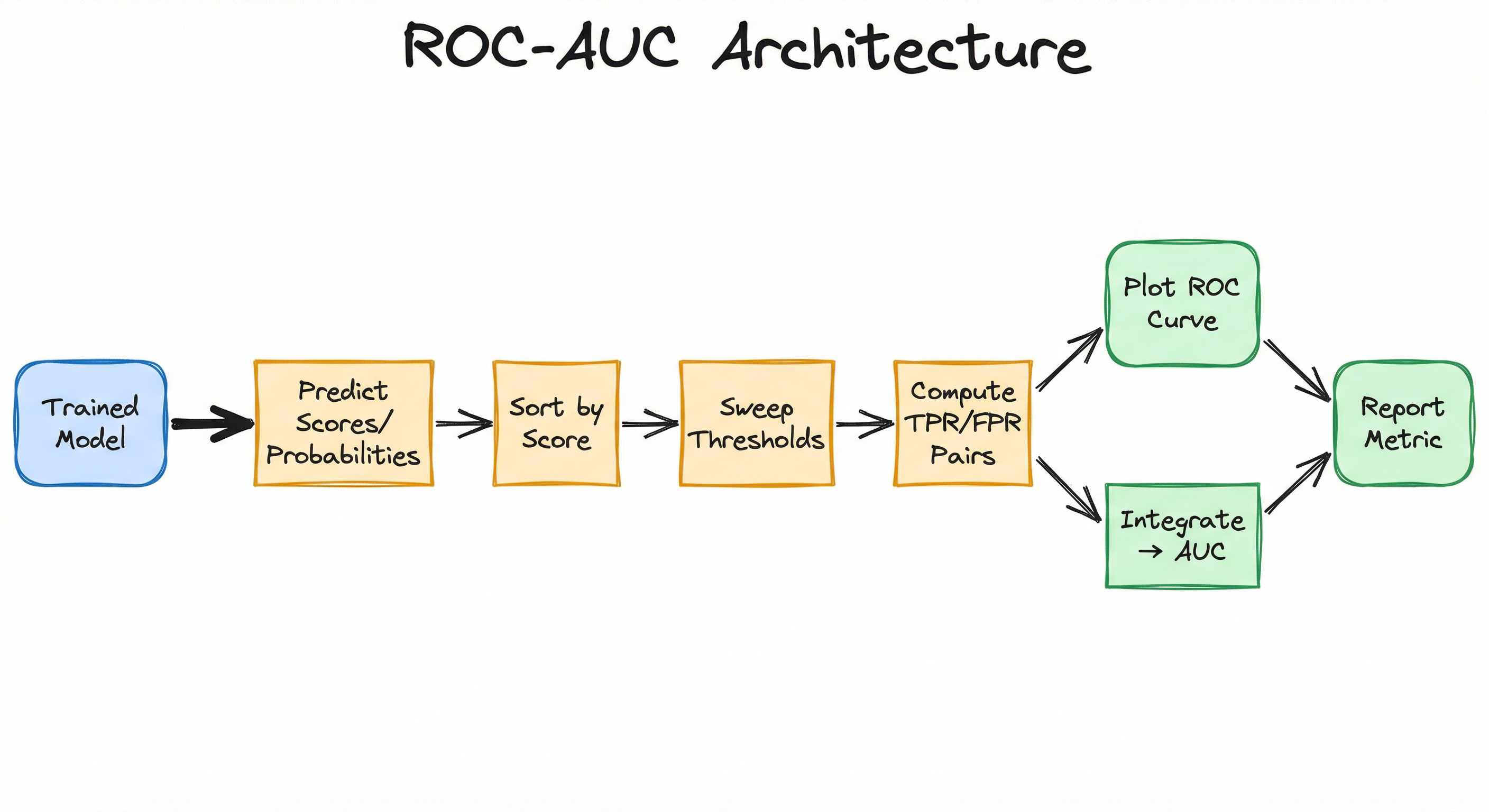
Key Components
Score Predictor
Generates predicted probabilities or decision scores for each test sample. For probabilistic classifiers (logistic regression, neural networks with sigmoid), this is the predicted probability. For SVM or tree ensembles, this might be a distance-based score or aggregated vote proportion.
Threshold Sweeper
Iterates through all unique predicted scores as candidate thresholds, computing a confusion matrix at each step. In practice, implementations optimize this by sorting predictions once and incrementally updating counts.
Rate Calculator
Computes TPR and FPR from the confusion matrix at each threshold. TPR = TP/(TP+FN), FPR = FP/(FP+TN). These values become the (x, y) coordinates of one point on the ROC curve.
Curve Plotter
Visualizes the ROC curve by plotting (FPR, TPR) pairs. Includes the diagonal reference line (random classifier) and optional operating point markers for specific thresholds.
AUC Integrator
Numerically integrates the area under the ROC curve using the trapezoidal rule. Returns a scalar score between 0.5 and 1.0 summarizing discrimination ability.
Optimal Threshold Selector (Optional)
Identifies the threshold that maximizes a chosen criterion, typically Youden's J statistic (J = TPR - FPR) or a cost-weighted metric based on business constraints.
Data Flow
Here's the step-by-step flow:
Step 1: Model predicts scores for all test samples → vector of shape (n,).
Step 2: Predictions are sorted in descending order alongside true labels.
Step 3: For each unique score value (used as threshold), compute TP, FP, TN, FN by comparing predictions ≥ threshold against labels.
Step 4: Calculate TPR and FPR at each threshold → list of (FPR, TPR) coordinate pairs.
Step 5: Plot these coordinates to visualize the ROC curve.
Step 6: Apply trapezoidal integration over the (FPR, TPR) pairs to compute AUC.
Step 7: Optionally, identify the threshold maximizing Youden's J or another criterion for deployment.
Modern libraries like scikit-learn's roc_curve() and roc_auc_score() handle Steps 2-6 automatically with optimized implementations.
A directed flow from trained model → score prediction → threshold sweep → TPR/FPR computation → ROC plotting and AUC integration → final metric reporting.
How to Implement
Computing ROC-AUC in Practice
Implementing ROC-AUC breaks down into two tasks: (1) computing the curve coordinates (FPR, TPR pairs at each threshold), and (2) integrating the area under the curve. The naive approach -- looping through every threshold and recomputing the full confusion matrix -- is where is the number of samples. Optimized implementations sort once and incrementally update counts, achieving .
For production systems, always use battle-tested libraries: scikit-learn in Python, pROC or ROCR in R, MLlib in Spark, and rocmetrics in MATLAB. Rolling your own implementation is a recipe for off-by-one errors and performance bottlenecks.
Multi-Class Considerations
For multi-class problems (K > 2), you need to choose:
- One-vs-Rest (OvR): Each class vs. all others. Sensitive to class imbalance in the "rest" grouping.
- One-vs-One (OvO): All pairwise combinations. Robust to imbalance but computationally expensive for large K.
- Averaging strategy: Macro (unweighted mean), weighted (by class support), or micro (treat all samples equally).
scikit-learn supports all these via roc_auc_score(multi_class='ovr'|'ovo', average='macro'|'weighted').
Cost Note: For a fraud detection system processing 10M transactions/day in India, computing ROC-AUC during offline evaluation is negligible (milliseconds). But if you're running A/B tests with 20 model variants and bootstrapping confidence intervals (2000 resamples), expect 5-10 minutes on a single CPU core. Budget accordingly or parallelize.
from sklearn.metrics import roc_curve, roc_auc_score, auc
import numpy as np
import matplotlib.pyplot as plt

# Example data: true labels and predicted probabilities
y_true = np.array([0, 0, 1, 1, 0, 1, 0, 1, 1, 0])
y_scores = np.array([0.1, 0.4, 0.35, 0.8, 0.2, 0.9, 0.3, 0.75, 0.65, 0.05])

# Compute ROC curve
fpr, tpr, thresholds = roc_curve(y_true, y_scores)

# Compute AUC
roc_auc = roc_auc_score(y_true, y_scores)
# Alternatively: roc_auc = auc(fpr, tpr)

print(f"AUC: {roc_auc:.3f}")

# Plot ROC curve
plt.figure(figsize=(8, 6))
plt.plot(fpr, tpr, color='darkorange', lw=2, label=f'ROC curve (AUC = {roc_auc:.2f})')
plt.plot([0, 1], [0, 1], color='navy', lw=2, linestyle='--', label='Random classifier')
plt.xlabel('False Positive Rate')
plt.ylabel('True Positive Rate')
plt.title('Receiver Operating Characteristic (ROC) Curve')
plt.legend(loc='lower right')
plt.grid(alpha=0.3)
plt.show()
This is the standard pattern for binary classification. roc_curve() returns FPR, TPR, and the corresponding threshold values. roc_auc_score() directly computes AUC without needing the curve coordinates. The plot shows your model's curve against the diagonal baseline (random classifier). Notice how thresholds are returned -- you can use these to select an optimal operating point.
from sklearn.metrics import roc_curve
import numpy as np

# Compute ROC curve
fpr, tpr, thresholds = roc_curve(y_true, y_scores)

# Calculate Youden's J statistic: J = TPR - FPR
J = tpr - fpr

# Find threshold that maximizes J
optimal_idx = np.argmax(J)
optimal_threshold = thresholds[optimal_idx]
optimal_tpr = tpr[optimal_idx]
optimal_fpr = fpr[optimal_idx]

print(f"Optimal threshold: {optimal_threshold:.3f}")
print(f"TPR at optimal: {optimal_tpr:.3f}")
print(f"FPR at optimal: {optimal_fpr:.3f}")
print(f"Youden's J: {J[optimal_idx]:.3f}")
Youden's J statistic identifies the threshold that maximizes the vertical distance between the ROC curve and the diagonal. This is a sensible default when false positives and false negatives have equal cost. For asymmetric costs (e.g., missing cancer is 10x worse than a false alarm), use a cost-weighted criterion instead.
from sklearn.metrics import roc_auc_score
from sklearn.preprocessing import label_binarize
import numpy as np

# Example: 3-class problem
y_true = np.array([0, 1, 2, 0, 1, 2, 0, 1, 2])
# Predicted probabilities: shape (n_samples, n_classes)
y_probs = np.array([
    [0.8, 0.1, 0.1],
    [0.2, 0.7, 0.1],
    [0.1, 0.2, 0.7],
    [0.9, 0.05, 0.05],
    [0.3, 0.6, 0.1],
    [0.1, 0.1, 0.8],
    [0.7, 0.2, 0.1],
    [0.2, 0.5, 0.3],
    [0.05, 0.15, 0.8],
])

# One-vs-Rest with macro averaging
auc_ovr_macro = roc_auc_score(y_true, y_probs, multi_class='ovr', average='macro')

# One-vs-One with macro averaging
auc_ovo_macro = roc_auc_score(y_true, y_probs, multi_class='ovo', average='macro')

print(f"AUC (OvR, macro): {auc_ovr_macro:.3f}")
print(f"AUC (OvO, macro): {auc_ovo_macro:.3f}")
For multi-class problems, you must supply predicted probabilities for all classes (shape n_samples × n_classes). OvR treats each class against all others; OvO computes all pairwise class comparisons. OvO is more robust to class imbalance. Macro averaging gives equal weight to each class, while weighted averaging accounts for class support.
from sklearn.metrics import roc_auc_score
from sklearn.utils import resample
import numpy as np

# Original data
y_true = np.array([0, 0, 1, 1, 0, 1, 0, 1, 1, 0])
y_scores = np.array([0.1, 0.4, 0.35, 0.8, 0.2, 0.9, 0.3, 0.75, 0.65, 0.05])

# Bootstrap parameters
n_bootstraps = 2000
rng_seed = 42
bootstrapped_scores = []

rng = np.random.RandomState(rng_seed)
for i in range(n_bootstraps):
    # Resample with replacement
    indices = rng.randint(0, len(y_scores), len(y_scores))
    if len(np.unique(y_true[indices])) < 2:
        # Skip if bootstrap sample has only one class
        continue
    score = roc_auc_score(y_true[indices], y_scores[indices])
    bootstrapped_scores.append(score)

# 95% confidence interval
ci_lower = np.percentile(bootstrapped_scores, 2.5)
ci_upper = np.percentile(bootstrapped_scores, 97.5)

print(f"AUC: {roc_auc_score(y_true, y_scores):.3f}")
print(f"95% CI: [{ci_lower:.3f}, {ci_upper:.3f}]")
Bootstrapping provides confidence intervals for AUC, essential for statistical comparisons between models. With 2000 resamples, you get stable 95% CI estimates. This is the gold standard for reporting AUC in research papers and clinical validation studies. Note: some bootstrap samples may have only one class -- skip these to avoid errors.
# Scikit-learn roc_auc_score configuration examples

# Binary classification (default)
auc = roc_auc_score(y_true, y_scores)

# Multi-class: One-vs-Rest, macro averaging
auc = roc_auc_score(y_true, y_probs, multi_class='ovr', average='macro')

# Multi-class: One-vs-One, weighted averaging (by class support)
auc = roc_auc_score(y_true, y_probs, multi_class='ovo', average='weighted')

# Custom sample weights (e.g., cost-sensitive learning)
auc = roc_auc_score(y_true, y_scores, sample_weight=sample_weights)
Common Implementation Mistakes
- ●
Using hard class predictions (0/1) instead of probabilities or scores. ROC-AUC requires continuous predictions to sweep thresholds. If you only have hard labels, you can't compute a meaningful ROC curve -- it will be a single point.
- ●
Ignoring class imbalance severity when relying on ROC-AUC alone. For datasets with 0.1% positives (e.g., fraud detection), ROC-AUC can be misleadingly optimistic. Always pair with precision-recall curves or check precision/recall at your actual operating threshold.
- ●
Comparing AUC scores across datasets with different class imbalances without context. AUC = 0.85 on a balanced dataset is very different from AUC = 0.85 on a 1:100 imbalance. The metric is threshold-agnostic but not imbalance-agnostic in interpretation.
- ●
Using the default 0.5 threshold for deployment after seeing good AUC. High AUC doesn't mean threshold = 0.5 is optimal for your cost structure. Always use domain knowledge or methods like Youden's J to select the threshold.
- ●
Forgetting to specify
multi_classandaverageparameters in scikit-learn for multi-class problems. The defaults may not match your evaluation goals. OvR vs. OvO and macro vs. weighted make a real difference -- choose deliberately. - ●
Reporting AUC without confidence intervals in research or production model cards. A single AUC value doesn't convey uncertainty. Bootstrap 95% CIs take minutes to compute and are standard practice in medical ML and high-stakes applications.
When Should You Use This?
Use When
You need a threshold-agnostic metric to compare multiple binary classifiers before committing to an operating point
Ranking quality matters more than hard classification accuracy (e.g., recommender systems, search ranking)
Classes are reasonably balanced (10:1 to 1:10 ratio) or you're using ROC-AUC alongside precision-recall analysis for imbalanced cases
You want to evaluate a model's discrimination ability in medical diagnosis, where sensitivity-specificity trade-offs are central to clinical decision-making
You're conducting A/B tests of fraud detection or credit scoring models and need a single metric for statistical comparison with confidence intervals
Avoid When
You have extreme class imbalance (e.g., 0.1% positives in fraud detection) and precision at your operating point matters more than overall ranking -- use precision-recall curves instead
You already know your deployment threshold and only care about performance at that specific point -- just compute precision/recall/F1 at that threshold directly
Misclassification costs are highly asymmetric (e.g., false negatives cost 100x more than false positives) and you need a cost-sensitive metric rather than a threshold-agnostic one
Your classifier outputs are not well-calibrated probabilities and you need probability calibration metrics (Brier score, calibration curves) rather than ranking metrics
The problem is multi-label (not multi-class) with many labels, making multi-class ROC-AUC extensions cumbersome -- consider label-wise metrics or hierarchical evaluation instead
Key Tradeoffs
ROC-AUC vs. Precision-Recall AUC
This is the big one. For balanced datasets (roughly equal positive and negative classes), ROC-AUC and PR-AUC will agree on model rankings. But for imbalanced datasets, they can diverge:
- ROC-AUC can be optimistic because the FPR denominator includes all negatives. With 1000 negatives and 10 positives, even 100 false positives only gives FPR = 0.1, which looks decent on a ROC curve.
- Precision-Recall AUC focuses on the positive class. Precision = TP / (TP + FP), so those 100 false positives destroy precision even if FPR is low.
Recent research (2024) challenges the old consensus, showing that ROC curves are actually robust to class imbalance while PR curves are highly sensitive. The practical takeaway: use both. ROC-AUC for overall discrimination, PR curves for positive-class-centric evaluation.
Threshold-Agnostic vs. Threshold-Specific Metrics
ROC-AUC gives you a holistic view across all thresholds, but you deploy at one threshold. If your optimal threshold is 0.2 and Model A has AUC = 0.90 but terrible precision at 0.2, while Model B has AUC = 0.87 but great precision at 0.2, which do you choose?
The answer: Model B. AUC is a guide, not gospel. Always validate performance at your intended operating point.
Interpretability vs. Completeness
AUC reduces an entire curve to a single number -- highly interpretable and easy to compare. But you lose information about the shape of the curve. Two models can have the same AUC but very different curves (one might dominate at low FPR, the other at high FPR). Always plot the full ROC curve for critical decisions.
Rule of Thumb: Use ROC-AUC for model selection and leaderboard comparisons. Use threshold-specific metrics (precision, recall, F1) for final validation before deployment. Use both ROC and PR curves for imbalanced data.
Alternatives & Comparisons
Precision-Recall (PR) curves plot precision vs. recall at varying thresholds. Unlike ROC curves, PR curves focus on the positive class, making them more informative for imbalanced datasets. While ROC-AUC can appear high even with many false positives (low FPR due to many negatives), PR-AUC directly penalizes false positives through precision. Use PR-AUC when positive class performance is paramount (fraud detection, rare disease diagnosis). The trade-off: PR curves don't have a fixed baseline like ROC's diagonal, making cross-dataset comparison less intuitive.
The PR curve is essentially ROC-AUC's twin for imbalanced settings. It plots precision (y-axis) against recall (x-axis). The key difference: precision uses TP/(TP+FP) instead of TN in the denominator, so it's unaffected by the large number of true negatives in imbalanced data. A perfect classifier reaches the top-right corner (precision=1, recall=1). Baseline is not a diagonal but a horizontal line at y = (positive samples / total samples). Use this when you care more about positive class mistakes than about correctly identifying negatives.
The confusion matrix shows raw counts (TP, FP, TN, FN) at a specific threshold. It's the foundation for all classification metrics, including ROC-AUC. Unlike ROC-AUC which aggregates across thresholds, the confusion matrix gives granular insight at your chosen operating point. Use it to understand what kinds of errors your model makes. Combine with ROC-AUC: use AUC for model comparison, use confusion matrix for error analysis.
Accuracy = (TP+TN)/(TP+FP+TN+FN) is threshold-dependent and highly misleading for imbalanced data. A classifier that predicts "negative" for everything gets 99% accuracy on a 1:99 imbalance. ROC-AUC avoids this trap by being threshold-independent and considering both sensitivity and specificity. Never use accuracy alone for imbalanced classification. ROC-AUC is almost always preferable except for perfectly balanced, low-stakes problems.
Pros, Cons & Tradeoffs
Advantages
Threshold-independent evaluation allows fair comparison of classifiers without committing to a specific decision boundary. You can evaluate models before knowing the deployment threshold.
Single scalar metric (AUC between 0.5 and 1.0) is highly interpretable: probability that a random positive ranks higher than a random negative. Easy to communicate to stakeholders.
Robust to class imbalance in the sense that it evaluates discrimination ability across all thresholds, unlike accuracy which collapses at high imbalance (though see cons for nuance).
Widely supported across all major ML libraries (scikit-learn, MLlib, TensorFlow, PyTorch, R's pROC) with optimized, battle-tested implementations that handle edge cases correctly.
Provides a comprehensive view of sensitivity-specificity trade-offs via the full ROC curve, enabling informed threshold selection based on business costs (e.g., Youden's J for equal costs).
Statistical machinery is well-developed: bootstrap confidence intervals, DeLong's test for comparing two AUCs, and established benchmarks across domains (0.7+ acceptable, 0.8+ good, 0.9+ excellent in most fields).
Disadvantages
Can be misleadingly optimistic on severely imbalanced datasets (0.1%-1% positive class) because FPR dilutes false positives across many negatives. A model with terrible precision can still show AUC > 0.9.
Aggregates across all thresholds, hiding poor performance at your actual deployment threshold. Model A might beat Model B on AUC but lose at the specific operating point you care about.
Does not account for probability calibration -- a model can have perfect AUC but completely miscalibrated probabilities. If you need accurate probabilities (not just rankings), AUC doesn't help.
For multi-class problems, OvR and OvO strategies give different scores, and there's no universally "correct" choice. Macro vs. weighted averaging adds another decision point.
Requires continuous predictions (probabilities or scores). If your classifier only outputs hard labels, you can't compute ROC-AUC. Some algorithms (e.g., K-NN without distance outputs) need modification.
Assumes that all threshold-operating points are equally likely, which is rarely true in practice. Most systems operate at one carefully chosen threshold, making the threshold-agnostic property less valuable than it appears.
Failure Modes & Debugging
Optimistic AUC on Extreme Imbalance
Cause
Dataset has severe class imbalance (e.g., 0.1% positives in fraud detection). The FPR denominator is dominated by true negatives, so even many false positives result in low FPR, making the ROC curve look good.
Symptoms
Model achieves AUC = 0.92 but precision at deployment threshold is only 5%. Stakeholders trust the high AUC and are surprised by poor real-world performance. False positives overwhelm human review capacity.
Mitigation
Always pair ROC-AUC with precision-recall curves for imbalanced data. Report precision, recall, and F1 at the intended deployment threshold. Consider using PR-AUC or cost-sensitive metrics (weighted F1, Matthews Correlation Coefficient) as primary metrics instead.
Ignoring Threshold-Specific Performance
Cause
Model selection based solely on AUC without checking performance at the actual deployment threshold. Two models with similar AUC can have very different precision/recall trade-offs at specific operating points.
Symptoms
Model A wins on AUC (0.89 vs. 0.87) but Model B has better precision at threshold = 0.3, which is your deployment target. You deploy Model A and regret it.
Mitigation
After using AUC for initial model selection, validate finalists at your intended threshold. Use domain knowledge or cost-benefit analysis to set the threshold (e.g., Youden's J, cost-weighted criteria). Always report threshold-specific metrics alongside AUC.
Miscalibrated Probabilities Masked by High AUC
Cause
Model has excellent ranking ability (high AUC) but poor probability calibration. For example, all predicted probabilities are between 0.6-0.8 regardless of true class likelihood.
Symptoms
AUC = 0.94 but calibration plot shows sigmoid-shaped curve far from the diagonal. Downstream systems that use predicted probabilities for cost-benefit decisions make poor choices. Brier score is high despite high AUC.
Mitigation
Check calibration curves (reliability diagrams) alongside ROC-AUC. Compute Brier score or expected calibration error (ECE). If probabilities matter for your use case, apply calibration methods (Platt scaling, isotonic regression) and re-evaluate.
Data Leakage Inflating AUC
Cause
Training data includes features that leak information from the future or from the target variable itself. Classic example: including transaction_declined as a feature when predicting fraud (the decline decision was made because of fraud).
Symptoms
AUC in cross-validation is 0.98+ but drops to 0.75 in production. The model learned to cheat on the training set using features unavailable at inference time.
Mitigation
Audit feature engineering for temporal leakage. Ensure all features are available before the prediction point. Use time-based splits for validation, not random K-fold. Compare training AUC to validation AUC -- huge gaps (>0.05) suggest overfitting or leakage.
Multi-Class Strategy Mismatch
Cause
For K > 2 classes, using One-vs-Rest (OvR) on imbalanced data or One-vs-One (OvO) without understanding the implications. OvR is sensitive to class imbalance in the 'rest' grouping; OvO is more robust but computationally expensive.
Symptoms
Model shows good AUC on majority classes but poor performance on minority classes. Macro-averaged AUC hides per-class performance disparities.
Mitigation
Use One-vs-One with macro averaging for imbalanced multi-class problems. Report per-class AUC scores in addition to macro/weighted averages. Visualize per-class ROC curves to identify which classes are poorly discriminated.
Placement in an ML System
Where Does ROC-AUC Fit in the ML Pipeline?
ROC-AUC lives in the evaluation phase, after training and before deployment. Here's the typical workflow:
During Development: Train multiple models (logistic regression, XGBoost, neural network). Use cross-validation with ROC-AUC as the scoring metric to identify the best architecture and hyperparameters.
After Training: Compute ROC-AUC on a held-out test set. Bootstrap 95% confidence intervals. Plot ROC curves to visualize discrimination. If AUC is acceptable (domain-dependent threshold), proceed to threshold selection.
Threshold Selection: Use the full ROC curve to pick the optimal threshold via Youden's J, cost-weighted criteria, or business rules (e.g., "we want TPR ≥ 0.9"). Validate precision/recall at this threshold.
A/B Testing: Deploy the model alongside the incumbent. Use ROC-AUC as the primary metric for comparing online performance. DeLong's test or bootstrapped CIs determine statistical significance.
Monitoring: After deployment, periodically re-compute ROC-AUC on recent data to detect model drift. Significant AUC drops (e.g., from 0.88 to 0.82) indicate degradation requiring retraining.
Key Insight: ROC-AUC is an offline evaluation metric, not a runtime metric. It guides model selection and threshold tuning, but once deployed, you monitor precision/recall at your chosen threshold, not AUC.
Pipeline Stage
Evaluation / Validation
Upstream
- Model Training
- Hyperparameter Tuning
- Cross-Validation
Downstream
- Model Selection
- Threshold Optimization
- A/B Testing
- Model Deployment
Scaling Bottlenecks
For a single model on a test set of size , computing ROC-AUC is due to sorting. This is negligible for M -- typically under 100ms. Bottlenecks appear in three scenarios:
1. Bootstrapping Confidence Intervals: 2000 bootstrap resamples each require re-sorting and integration. For K, expect 5-10 seconds on a single CPU core. Parallelize across cores to reduce to ~1-2 seconds.
2. Multi-Class with Many Classes: OvO computes pairwise AUCs. For classes, that's 4,950 ROC curves. Even with K samples, this takes 10+ seconds. OvR is faster ( curves) but less robust to imbalance.
3. Hyperparameter Tuning Loops: Grid search over 100 hyperparameter combinations × 5-fold CV = 500 AUC computations. For M per fold, that's 500 × 0.1s = 50 seconds just for metric computation (excluding training). Use GPU-accelerated libraries or approximate metrics if this becomes a bottleneck.
For real-time inference, ROC-AUC is irrelevant -- you compute it offline during evaluation, not per-prediction.
Production Case Studies
Academic research on financial fraud detection using explainable AI and stacking ensemble methods (XGBoost, LightGBM, CatBoost). The framework uses the IEEE-CIS Fraud Detection dataset with over 590,000 real transaction records, achieving high ROC-AUC scores.
The ensemble fraud detection framework achieved 99% accuracy with an AUC-ROC score of 0.99 on real-world banking transaction data. The research demonstrates how ROC-AUC effectively evaluates fraud detection models on imbalanced datasets typical in financial fraud scenarios.
ROC-AUC is the gold standard for medical diagnostic test evaluation. Rutter et al. used ROC curves to compare diagnostic tests for colorectal cancer screening. A case study on diabetic retinopathy diagnosis using deep learning CNNs illustrated how ROC-AUC balances sensitivity (detecting patients who need referral) and specificity (avoiding unnecessary referrals for healthy patients). In radiology, Lee Lusted pioneered ROC analysis in the 1960s to evaluate radiologists' ability to detect abnormalities in X-rays. Modern applications include cancer screening (mammography, CT scans), sepsis prediction in ICUs, and COVID-19 diagnosis from chest X-rays.
A diabetic retinopathy screening model with AUC = 0.94 means a 94% chance that the model assigns a higher risk score to a true positive (patient needing referral) than a false positive (healthy patient). By selecting thresholds via ROC analysis, clinicians can prioritize high sensitivity for life-threatening conditions (accepting more false positives) or high specificity for resource-limited settings (reducing unnecessary follow-ups). ROC-AUC enables evidence-based threshold selection aligned with clinical costs and resource constraints.
While not explicitly published, large-scale recommender systems at companies like Amazon, Flipkart, and Netflix use ROC-AUC (and related ranking metrics like AUC for implicit feedback) to evaluate recommendation quality. The problem: given user-item interaction history, predict which items a user will click/purchase. This is framed as binary classification (interact vs. not interact) with extreme imbalance (1000s of items, user interacts with <10). ROC-AUC measures whether the model ranks items the user will interact with higher than items they won't. However, due to imbalance, practitioners often prefer precision@k or NDCG for top-k recommendations.
For a product recommendation system serving 100M users in India, even a 0.02 improvement in AUC (from 0.83 to 0.85) can translate to millions of additional conversions. The challenge: AUC optimizes global ranking quality, but users only see top-10 recommendations. Thus, precision@10 and NDCG@10 are preferred for final evaluation, while AUC guides offline model selection and hyperparameter tuning.
Tooling & Ecosystem
The de facto standard for ROC-AUC in Python. Provides roc_curve() for computing (FPR, TPR, thresholds), roc_auc_score() for direct AUC calculation, and auc() for integrating any curve. Supports binary, multi-class (OvR, OvO), and multi-label classification. Handles edge cases (single-class samples, tied scores) correctly. Optimized C implementation for large datasets.
Comprehensive ROC analysis package for R. Computes ROC curves, AUC, partial AUC, and confidence intervals via bootstrap or DeLong's method. Supports statistical tests for comparing two or more ROC curves. Includes plotting functions with extensive customization. Gold standard for clinical and biostatistics research.
Another popular R package for ROC analysis and visualization. Offers flexible performance curve plotting (ROC, precision-recall, lift curves) with aesthetic customization. Simpler API than pROC for basic use cases, but fewer statistical tests.
Distributed ROC-AUC computation for big data. BinaryClassificationEvaluator in PySpark computes AUC on datasets too large for single-machine scikit-learn. Integrates with Spark ML pipelines. Essential for datasets with billions of samples distributed across a cluster.
tf.keras.metrics.AUC computes ROC-AUC as a streaming metric during training. Useful for monitoring model performance across epochs without storing all predictions. Supports multi-class and multi-label settings. GPU-accelerated when used with TensorFlow.
torchmetrics.AUROC provides ROC-AUC for PyTorch models with GPU acceleration. Supports multi-class, multi-label, and multi-dimensional inputs. Integrates seamlessly with PyTorch Lightning for automatic metric logging.
rocmetrics class in MATLAB for binary and multi-class ROC analysis. Includes perfcurve() for plotting and confidence intervals. Industry-standard in aerospace, automotive, and industrial ML applications. Commercial license required.
Research & References
Peterson, Birdsall & Fox (1954)IRE Professional Group on Information Theory
Foundational work applying signal detection theory to human perception and decision-making under uncertainty. Established the mathematical framework for ROC analysis in radar systems during WWII, later adapted to medical diagnosis and ML classification.
Tanner Jr. & Swets (1954)Psychological Review
Extended signal detection theory to visual perception and psychophysics. Introduced the concept of decision criteria and ROC curves for measuring observer performance, forming the basis for modern threshold selection methods.
Egan, James P. (1975)Academic Press
Comprehensive treatment of signal detection theory and ROC analysis. Provided rigorous mathematical proofs of the relationship between AUC and the Wilcoxon-Mann-Whitney U statistic. Established ROC analysis as the gold standard for evaluating diagnostic systems.
Fawcett, Tom (2006)Pattern Recognition Letters
Highly cited tutorial on ROC analysis for machine learning practitioners. Explains ROC curves, AUC, optimal threshold selection, and common pitfalls. Bridges the gap between signal detection theory and modern classification metrics.
Saito & Rehmsmeier (2015)PLOS ONE
Demonstrated that PR curves are more informative than ROC curves for highly imbalanced datasets by showing that ROC curves can present an overly optimistic view of classifier performance. Widely cited in imbalanced learning research.
Richardson, Trevizani, Greenbaum, Carter, Nielsen & Peters (2024)Patterns (Cell Press)
Challenges the 2015 Saito & Rehmsmeier consensus. Shows via simulation and case studies that ROC curves are robust to class imbalance while PR curves are highly sensitive. Argues that PR-AUC cannot be easily normalized for imbalance, making ROC-AUC preferable for comparing models across datasets.
Huang et al. (2024)PLOS ONE
Empirical analysis of 156 data scenarios, 18 evaluation metrics, and 5 ML models. Found that AUC has the smallest variance in evaluating individual models and the smallest variance in model ranking compared to precision, recall, F1, MCC, and others. Recommends AUC as the primary metric for consistent model evaluation.
DeLong, DeLong & Clarke-Pearson (1988)Biometrics
Introduced DeLong's test for statistically comparing two ROC curves derived from the same test set (correlated samples). Provides p-values and confidence intervals for AUC differences. Standard method in medical statistics for A/B testing diagnostic models.
Interview & Evaluation Perspective
Common Interview Questions
- ●
Explain ROC-AUC to a non-technical stakeholder. What does an AUC of 0.85 mean in practical terms?
- ●
When would you use ROC-AUC vs. precision-recall AUC? Give an example scenario for each.
- ●
You have a fraud detection model with AUC = 0.92, but precision at your deployment threshold is only 10%. What's happening, and how do you fix it?
- ●
How would you select the optimal decision threshold for a binary classifier? Walk me through Youden's J statistic.
- ●
Explain the difference between One-vs-Rest and One-vs-One for multi-class ROC-AUC. When would you choose each?
- ●
Your model shows AUC = 0.98 in cross-validation but 0.78 in production. What are the top 3 possible causes?
Key Points to Mention
- ●
AUC is the probability that a randomly chosen positive instance ranks higher than a randomly chosen negative instance -- this is the single most intuitive explanation for non-technical audiences.
- ●
ROC-AUC is threshold-independent, evaluating discrimination across all thresholds. This makes it ideal for model comparison before knowing the deployment threshold, but you still need to validate threshold-specific metrics before deploying.
- ●
For imbalanced datasets, always pair ROC-AUC with precision-recall curves. Recent research (2024) shows ROC is robust to imbalance, but PR curves focus on positive class performance, which is often the priority.
- ●
Youden's J statistic (J = TPR - FPR) identifies the threshold maximizing the vertical distance from the diagonal. This is optimal when false positives and false negatives have equal cost. For asymmetric costs, use a cost-weighted criterion.
- ●
Multi-class strategies: OvR (one class vs. rest) is sensitive to imbalance; OvO (all pairwise comparisons) is robust but computationally expensive. Macro averaging treats classes equally; weighted averaging accounts for class support.
- ●
High AUC doesn't guarantee good calibration. A model can have AUC = 0.95 but poor probability estimates. Check calibration curves if downstream systems use predicted probabilities.
Pitfalls to Avoid
- ●
Claiming ROC-AUC is perfect for imbalanced data without mentioning it can be optimistic when FPR is low despite many false positives. Always discuss the trade-off and recommend PR curves as a complement.
- ●
Forgetting that AUC is threshold-agnostic but deployment is threshold-specific. Never recommend deploying based on AUC alone without checking precision/recall at the intended operating point.
- ●
Confusing ROC-AUC with accuracy or using them interchangeably. Accuracy is threshold-dependent and misleading for imbalanced data; AUC is threshold-independent and measures discrimination ability.
- ●
Saying 'AUC = 0.5 means the model is useless' without explaining that 0.5 corresponds to random guessing -- the model has zero discrimination ability, equivalent to a coin flip.
- ●
Ignoring the importance of confidence intervals. In production, always report bootstrapped 95% CIs for AUC to quantify uncertainty, especially when comparing models (e.g., AUC = 0.87 ± 0.03 vs. 0.85 ± 0.04).
Senior-Level Expectation
A senior candidate should articulate the probabilistic interpretation of AUC (ranking probability), explain the threshold-agnostic vs. threshold-specific trade-off, and demonstrate awareness of when ROC-AUC fails (extreme imbalance, calibration-sensitive tasks). They should be able to design an A/B test comparing two models using DeLong's test or bootstrapped CIs, select optimal thresholds via Youden's J or cost-weighted criteria, and explain multi-class strategies (OvR vs. OvO, macro vs. weighted averaging) with concrete examples. For imbalanced datasets, they should proactively recommend PR curves alongside ROC-AUC. Finally, they should connect ROC-AUC to business impact: 'A 0.03 AUC improvement from 0.85 to 0.88 in a fraud detection system processing 1M transactions/day at INR 5000 average fraud value could save INR 45 lakh/month by catching 300 additional frauds while maintaining precision.' Quantifying metric improvements in INR or user impact demonstrates senior-level systems thinking.
Summary
Let's bring it all together.
ROC-AUC is a threshold-independent metric that evaluates a binary classifier's ability to discriminate between classes by plotting True Positive Rate against False Positive Rate across all decision thresholds. The AUC (Area Under the Curve) summarizes this into a single scalar between 0.5 (random) and 1.0 (perfect), interpretable as the probability that the model ranks a random positive instance higher than a random negative instance.
When to use it: ROC-AUC excels when you need to compare models without committing to a threshold, when ranking quality matters (search, recommendations), and when classes are reasonably balanced or you pair it with precision-recall analysis. It's the gold standard in medical diagnosis, fraud detection, and credit scoring.
When to be cautious: Extreme imbalance (0.1% positives) can make ROC-AUC optimistically high while precision at your deployment threshold is terrible. Always validate threshold-specific metrics. High AUC doesn't guarantee good probability calibration. Multi-class extensions (OvR vs. OvO) require deliberate choices.
Key technical points: (1) AUC is equivalent to the Wilcoxon-Mann-Whitney U statistic. (2) Youden's J statistic (J = TPR - FPR) selects optimal thresholds for equal costs. (3) Bootstrap 95% confidence intervals are standard for statistical comparisons. (4) For multi-class, OvO is robust to imbalance; OvR is faster. (5) Gini = 2 × AUC - 1 is the same metric, different scale.
Practical workflow: Use ROC-AUC for initial model selection and hyperparameter tuning. Plot full ROC curves to visualize trade-offs. Select thresholds via Youden's J or cost-based criteria. Validate precision/recall at the chosen threshold. For imbalanced data, complement with PR curves. Bootstrap CIs for production model cards.
Final Insight: ROC-AUC measures ranking ability, not decision quality at a specific threshold. It's a powerful tool for model comparison, but deployment success depends on choosing the right threshold for your business context and validating performance at that operating point. Master both the metric and the context, and you'll ship robust classifiers that actually work in production.