Residual Plot in Machine Learning
A residual plot is the single most important diagnostic visualization in regression analysis. While scalar metrics like R², MAE, and RMSE collapse your model's performance into a single number, a residual plot preserves the structure of your errors, revealing patterns that no summary statistic can capture. Heteroscedasticity, non-linearity, outliers, influential observations — all of these are invisible to a metric but glaringly obvious in a well-constructed residual plot.
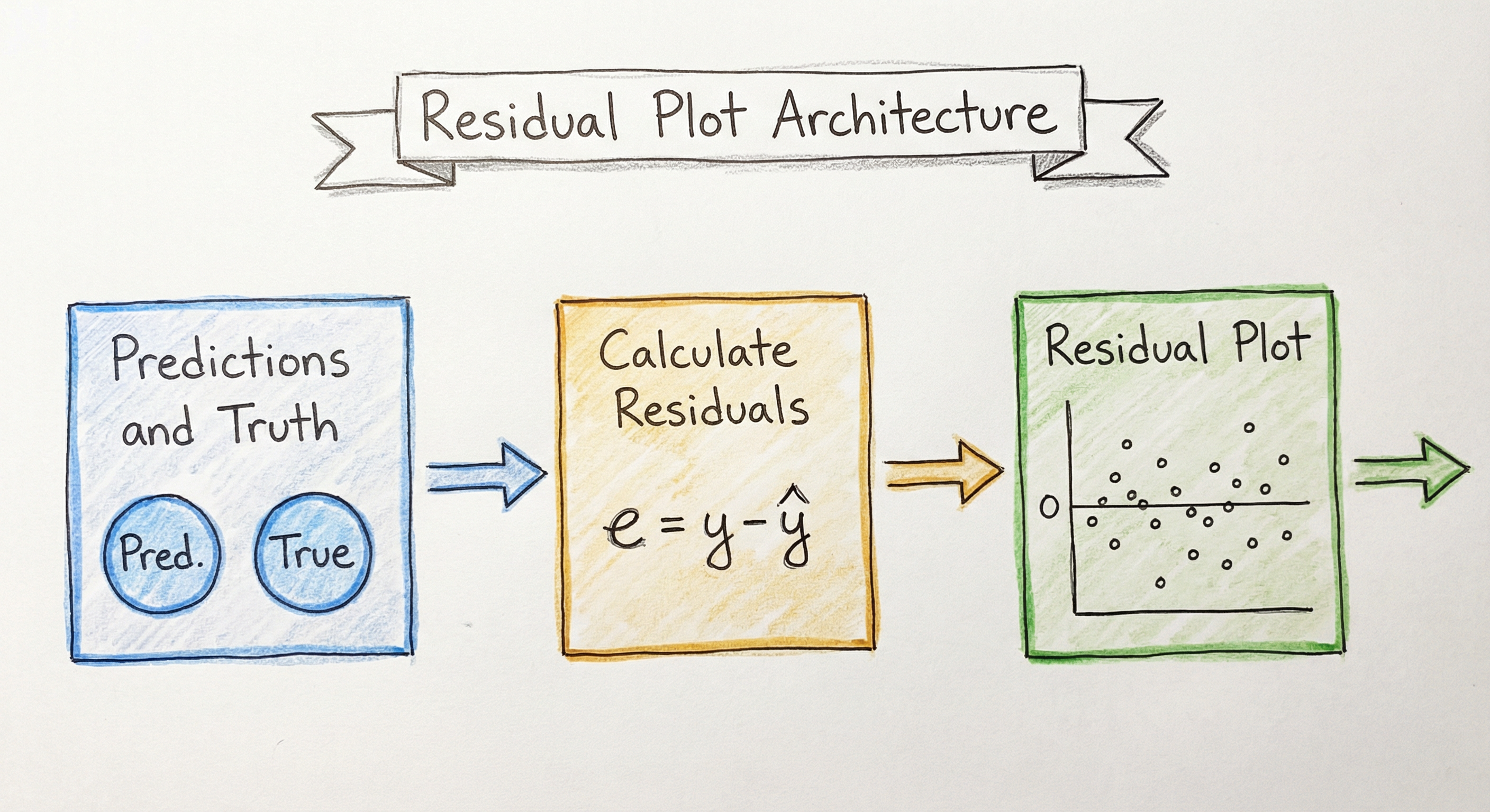
The core idea is simple: plot the difference between what your model predicted and what actually happened (the residual, ) against fitted values, features, or observation order. If your model is well-specified, residuals should look like random noise — a shapeless cloud centered at zero. Any visible pattern is a diagnostic signal telling you something about your model's deficiencies.
In production ML systems — from Uber's ETA prediction to Zillow's Zestimate — residual analysis is what separates a model that looks good on aggregate metrics from one that actually behaves correctly across the full range of inputs. An R² of 0.90 might hide the fact that your model systematically under-predicts for high-value homes and over-predicts for low-value ones. A residual plot would expose that immediately.
This guide covers every facet of residual plots: from the foundational mathematics of standardized and studentized residuals, through advanced diagnostics like Cook's distance and leverage analysis, to practical implementation with matplotlib, seaborn, statsmodels, and Yellowbrick.
Concept Snapshot
- What It Is
- A diagnostic scatter plot that visualizes the differences (residuals) between observed and predicted values, revealing patterns in model errors that summary metrics miss.
- Category
- Evaluation
- Complexity
- Intermediate
- Inputs / Outputs
- Inputs: predicted values (y-hat) and ground truth labels (y). Outputs: residual values (y - y-hat) plotted against fitted values, features, or observation index.
- System Placement
- Applied during model evaluation, validation, and ongoing monitoring to diagnose model misspecification, assumption violations, and data quality issues.
- Also Known As
- residuals vs fitted plot, residual scatter plot, diagnostic plot, error plot, prediction error plot
- Typical Users
- Data scientists, ML engineers, Statisticians, Research scientists, MLOps engineers
- Prerequisites
- Linear regression fundamentals, Residuals and error terms, Mean Squared Error and R², Basic probability and distributions, Matplotlib or seaborn basics
- Key Terms
- residual (e = y - y-hat)standardized residualstudentized residualheteroscedasticityhomoscedasticityQ-Q plotCook's distanceleveragehat matrixinfluence
Why This Concept Exists
The Problem with Summary Metrics
Imagine you build a regression model to predict apartment rental prices in Bengaluru. Your model achieves an R² of 0.88 and an MAE of ₹2,500. By every scalar metric, this looks like a solid model. You deploy it.
Two weeks later, complaints start rolling in. Tenants in upscale neighborhoods like Indiranagar and Koramangala report that your predictions are consistently ₹8,000-₹12,000 too low. Meanwhile, predictions for budget apartments in the outskirts are ₹3,000-₹5,000 too high. The aggregate MAE of ₹2,500 is real — but it hides a systematic pattern in the errors. Your model under-predicts expensive apartments and over-predicts cheap ones.
A single residual plot — residuals vs. fitted values — would have caught this before deployment. The plot would show a clear downward slope: negative residuals (under-predictions) on the right side (high-value predictions) and positive residuals (over-predictions) on the left (low-value predictions). That pattern screams "your model has a non-linear relationship that it's treating as linear."
This is why residual plots exist. They preserve the spatial structure of errors that aggregate metrics destroy.
Historical Roots: Anscombe's Quartet
The importance of visual diagnostics was famously demonstrated by Francis Anscombe in his 1973 paper "Graphs in Statistical Analysis" published in The American Statistician. Anscombe constructed four datasets — now called Anscombe's Quartet — that share identical summary statistics (same mean, variance, correlation, regression line, R²) but look completely different when plotted. One dataset is a clean linear relationship. Another is a perfect parabola. A third is a line with a single outlier. The fourth has all points at the same x-value except one extreme point.
The lesson was devastating in its simplicity: summary statistics lie when you don't look at your data. Residual plots are the primary tool for "looking at your data" in the context of regression.
From Classical Statistics to Modern ML
In classical statistics (1960s-1990s), residual analysis was the backbone of model diagnostics. Textbooks by Draper & Smith, Belsley, Kuh & Welsch, and Cook & Weisberg formalized the theory of influence diagnostics, leverage points, and residual patterns. Every statistics course taught students to examine four diagnostic plots: residuals vs. fitted, Q-Q plot, scale-location, and residuals vs. leverage.
As machine learning grew in popularity (2000s onward), residual analysis fell out of fashion. Practitioners focused on cross-validated metrics and ensemble methods. But the fundamental problem persists: aggregate metrics hide systematic errors. A gradient boosted tree with 0.90 R² can still exhibit heteroscedasticity, regional bias, or sensitivity to individual training points. The recent surge of interest in ML explainability and model monitoring has brought residual analysis back — this time as a production monitoring tool, not just a statistical formality.
Key Insight: Residual plots are not just for linear regression. They are equally valuable — arguably more valuable — for diagnosing issues in random forests, gradient boosting, neural networks, and any model that produces continuous predictions.
Core Intuition & Mental Model
The Mental Model: Signal vs. Noise
Here's the simplest way to think about residual plots: a good model should leave behind only noise.
When you fit a regression model, you're decomposing your data into two parts: the signal (what the model captured) and the residuals (what the model missed). If the model captured all the signal, the residuals should be pure random noise — no patterns, no structure, no dependence on anything.
A residual plot checks this assumption visually. Plot residuals against fitted values, and if you see:
- A shapeless cloud: Your model has captured the signal well. The residuals are noise.
- A funnel shape (residuals spread out or narrow): Heteroscedasticity — your model's errors are larger for some predictions than others. For example, predicting house prices with flat MAE when cheap houses have small errors and expensive houses have large errors.
- A curve or U-shape: Non-linearity — your model is using a linear approximation for a non-linear relationship. The model systematically over-predicts in some ranges and under-predicts in others.
- Clusters or bands: Missing categorical variable — there's a grouping factor your model doesn't know about. For instance, predicting delivery times without accounting for vehicle type (bike vs. car) would create two bands of residuals.
- A trend (upward or downward): Systematic bias — your model consistently gets worse as predictions get larger (or smaller).
The Analogy: A Doctor's Diagnostic
Think of residual analysis as a doctor examining a patient. Your scalar metrics (R², MAE, RMSE) are like checking body temperature — they tell you if something is generally wrong, but they don't tell you what or where. Residual plots are like an X-ray: they show you the specific structural problem.
A patient with "normal" body temperature might still have a broken bone. A model with "good" R² might still have systematic errors in specific regions of the input space. You need both the thermometer and the X-ray.
Why Patterns in Residuals Matter
Every pattern in a residual plot has a specific diagnostic meaning:
- Fan/funnel shape Variance of errors depends on prediction magnitude Use weighted least squares, log-transform the target, or use heteroscedasticity-robust standard errors.
- U-shape or parabola Missing quadratic or polynomial term Add polynomial features or use a non-linear model.
- Periodic waves Time-series seasonality not captured Add Fourier features or seasonal dummies.
- Isolated extreme points Outliers or influential observations Investigate data quality; use robust regression.
Key Insight: A random-looking residual plot doesn't guarantee your model is correct — it could be missing signal that looks random at this resolution. But a patterned residual plot guarantees your model is wrong in a specific, diagnosable way.
Technical Foundations
Mathematical Foundation
Given observations with true values and predicted values for , the raw residual for observation is:
A residual plot is a scatter plot of residuals (vertical axis) against fitted values , a predictor variable , or the observation index (horizontal axis).
Types of Residuals
Raw Residuals are the simplest form, but they have non-constant variance even when the true errors are homoscedastic. This is because the variance of the -th residual depends on the leverage of that observation:
where is the -th diagonal element of the hat matrix .
Standardized Residuals correct for this by dividing by the estimated standard deviation:
where is the residual standard error: and is the number of predictors.
Studentized (Externally Studentized) Residuals use a leave-one-out estimate of variance:
where is the residual standard error computed without observation . These follow a -distribution with degrees of freedom under the null hypothesis, making them suitable for formal outlier testing.
Leverage and the Hat Matrix
The leverage measures how far observation is from the center of the predictor space. For ordinary least squares:
An observation with high leverage has an unusual combination of predictor values. High leverage alone doesn't make a point influential — it needs to also have a large residual.
Cook's Distance
Cook's distance measures the overall influence of observation on the regression coefficients by combining leverage and residual magnitude:
Alternatively, it can be expressed as:
where is the vector of fitted values obtained when observation is deleted from the data. Common thresholds: (conservative) or (liberal).
DFFITS and DFBETAS
DFFITS measures how much the predicted value for observation changes when that observation is removed:
DFBETAS measures how much each regression coefficient changes when observation is removed. These are related to Cook's distance but provide coefficient-level diagnostics.
Formal Tests for Residual Patterns
Breusch-Pagan Test for heteroscedasticity: Tests whether the variance of residuals is related to the predictor variables. Under the null hypothesis of homoscedasticity, the test statistic follows a distribution with degrees of freedom.
Shapiro-Wilk Test for normality: Tests whether the residuals come from a normal distribution. Used alongside Q-Q plots for residual normality diagnostics.
Durbin-Watson Test for autocorrelation: Tests whether residuals are serially correlated (important for time-series data). The statistic ranges from 0 to 4, with values near 2 indicating no autocorrelation.
Computational Complexity
Computing raw residuals is . Computing leverage values requires the hat matrix, which involves matrix inversion: for observations and features. Cook's distance is after leverage is computed. For large and moderate , the bottleneck is the hat matrix computation.
Internal Architecture
A residual analysis pipeline in a production ML system involves multiple stages: computing raw residuals, standardizing them, generating diagnostic visualizations, running formal statistical tests, and flagging anomalies. While the individual calculations are simple, orchestrating them into an automated diagnostic report requires careful architecture.
Key Components
Residual Calculator
Computes raw residuals from ground truth and predictions. Handles missing values, misaligned arrays, and multi-output regression. Optionally computes percentage residuals () for relative analysis.
Standardization Engine
Transforms raw residuals into standardized or studentized residuals using the estimated variance and leverage values. Requires the hat matrix for leverage computation, which depends on the model's feature matrix .
Leverage Analyzer
Computes diagonal elements of the hat matrix to determine how unusual each observation's predictor values are. Flags observations with as high-leverage points.
Cook's Distance Calculator
Combines standardized residuals and leverage into a single influence measure per observation. Identifies points that disproportionately affect the regression coefficients. Uses threshold for flagging.
Visualization Generator
Produces the four canonical diagnostic plots: (1) residuals vs. fitted values, (2) Q-Q plot for normality, (3) scale-location plot for homoscedasticity, (4) residuals vs. leverage for influence diagnostics. Uses matplotlib, seaborn, or Yellowbrick.
Statistical Test Runner
Executes formal tests: Breusch-Pagan for heteroscedasticity, Shapiro-Wilk for normality, Durbin-Watson for autocorrelation. Returns p-values and test statistics alongside visual diagnostics for quantitative confirmation.
Pattern Detector
Automated analysis of residual plots to detect common patterns (funnel shape, curvature, clustering). Can use simple heuristics (correlation between |residuals| and fitted values) or ML-based anomaly detection on the residual distribution.
Data Flow
Step 1: Ground truth (y) and predictions (y-hat) enter the residual calculator, which computes raw residuals. Step 2: If the model's feature matrix (X) is available, leverage values are computed from the hat matrix. Step 3: Raw residuals and leverage are combined to produce standardized residuals, studentized residuals, and Cook's distance. Step 4: The visualization generator creates diagnostic plots (residuals vs. fitted, Q-Q plot, scale-location, residuals vs. leverage). Step 5: Statistical tests (Breusch-Pagan, Shapiro-Wilk, Durbin-Watson) are run on the residuals for quantitative confirmation. Step 6: The pattern detector flags anomalies: heteroscedasticity, non-linearity, influential points. Step 7: Results are logged to the metrics store or trigger alerts if patterns exceed thresholds.
A pipeline starting with ground truth and predictions feeding into a residual calculator that produces raw residuals. These flow into three parallel paths: standardization (producing standardized residuals for diagnostic plots), Cook's distance calculation, and leverage analysis. The diagnostic plots and influence measures converge into a pattern detection module that decides whether to alert or log.
How to Implement
Implementation Approaches
Residual plots can be created with varying levels of sophistication, from a simple matplotlib scatter plot to a full diagnostic dashboard with automated pattern detection.
Level 1 — Quick Diagnostic: Use matplotlib or seaborn to create a basic residuals-vs-fitted plot. Good for exploration during model development.
Level 2 — Standard Diagnostics: Use statsmodels for the four canonical diagnostic plots (residuals vs. fitted, Q-Q plot, scale-location, residuals vs. leverage) along with formal tests.
Level 3 — Production Diagnostics: Use Yellowbrick for integrated visualization with scikit-learn, or build custom dashboards that compute residual diagnostics on streaming predictions and trigger alerts.
Key Implementation Considerations
1. Which residual type to use: For simple visualization, raw residuals are fine. For outlier detection and formal testing, use studentized residuals because they follow a known distribution (t-distribution) under the null hypothesis.
2. Sample size for reliable diagnostics: Residual patterns become visually interpretable with at least 30-50 observations. For detecting subtle heteroscedasticity, you typically need 100+ observations. For reliable Cook's distance analysis, the threshold works best with 50+ observations.
3. Handling non-linear models: For random forests or neural networks, you don't have a hat matrix or leverage values. You can still plot raw residuals vs. fitted values to detect heteroscedasticity and non-linearity. For influence analysis, use permutation-based approaches or leave-one-out cross-validation.
4. Cost considerations: Computing full leverage and Cook's distance requires the hat matrix, which is . For a dataset with 1 million rows and 500 features at a company like Flipkart or Razorpay, this can take significant memory (~4 GB for the hat matrix alone). Use sampling (e.g., 10,000 random observations) for diagnostic plots in production.
Cost Note: Running residual diagnostics on a 1M-row dataset in a cloud environment (Azure, AWS) costs approximately ₹50-₹200 (2.50) per run. For daily monitoring, budget ₹1,500-₹6,000 (75) per model per month.
import numpy as np
import matplotlib.pyplot as plt
from sklearn.linear_model import LinearRegression
from sklearn.datasets import make_regression

# Generate sample data
X, y = make_regression(n_samples=200, n_features=3, noise=15, random_state=42)

# Fit model
model = LinearRegression()
model.fit(X, y)
y_pred = model.predict(X)

# Compute residuals
residuals = y - y_pred

# Create residual plot
fig, axes = plt.subplots(1, 2, figsize=(14, 5))

# Plot 1: Residuals vs Fitted Values
axes[0].scatter(y_pred, residuals, alpha=0.6, edgecolors='k', linewidth=0.5)
axes[0].axhline(y=0, color='r', linestyle='--', linewidth=1)
axes[0].set_xlabel('Fitted Values (y-hat)')
axes[0].set_ylabel('Residuals (y - y-hat)')
axes[0].set_title('Residuals vs Fitted Values')

# Plot 2: Histogram of residuals
axes[1].hist(residuals, bins=30, edgecolor='black', alpha=0.7)
axes[1].set_xlabel('Residual Value')
axes[1].set_ylabel('Frequency')
axes[1].set_title('Distribution of Residuals')

plt.tight_layout()
plt.savefig('residual_plot.png', dpi=150, bbox_inches='tight')
plt.show()

print(f"Mean of residuals: {np.mean(residuals):.4f}")
print(f"Std of residuals: {np.std(residuals):.4f}")
print(f"Residuals range: [{np.min(residuals):.2f}, {np.max(residuals):.2f}]")
This is the most fundamental residual plot. The scatter plot on the left shows residuals against fitted values — you're looking for a random cloud centered at zero. Any pattern (funnel, curve, trend) indicates a problem. The histogram on the right shows the distribution of residuals, which should be approximately normal and centered at zero for well-specified linear models.
import numpy as np
import matplotlib.pyplot as plt
import statsmodels.api as sm
from statsmodels.graphics.regressionplots import plot_leverage_resid2
from scipy import stats

# Generate data with a non-linear relationship (to show pattern)
np.random.seed(42)
X = np.random.uniform(1, 10, 150)
y = 3 + 2 * X + 0.5 * X**2 + np.random.normal(0, 5, 150)

# Fit a LINEAR model (deliberately misspecified)
X_with_const = sm.add_constant(X)
ols_model = sm.OLS(y, X_with_const).fit()

# Four canonical diagnostic plots
fig, axes = plt.subplots(2, 2, figsize=(14, 10))

# 1. Residuals vs Fitted
fitted = ols_model.fittedvalues
residuals = ols_model.resid
std_resid = ols_model.get_influence().resid_studentized_internal

axes[0, 0].scatter(fitted, std_resid, alpha=0.6, edgecolors='k', linewidth=0.5)
axes[0, 0].axhline(y=0, color='r', linestyle='--')
axes[0, 0].set_xlabel('Fitted Values')
axes[0, 0].set_ylabel('Standardized Residuals')
axes[0, 0].set_title('1. Residuals vs Fitted')
# Add LOWESS smoothing line
from statsmodels.nonparametric.smoothers_lowess import lowess
smoothed = lowess(std_resid, fitted, frac=0.6)
axes[0, 0].plot(smoothed[:, 0], smoothed[:, 1], 'b-', linewidth=2)

# 2. Q-Q Plot
sm.qqplot(std_resid, line='45', ax=axes[0, 1], alpha=0.6)
axes[0, 1].set_title('2. Normal Q-Q Plot')

# 3. Scale-Location Plot
sqrt_abs_resid = np.sqrt(np.abs(std_resid))
axes[1, 0].scatter(fitted, sqrt_abs_resid, alpha=0.6, edgecolors='k', linewidth=0.5)
smoothed_sl = lowess(sqrt_abs_resid, fitted, frac=0.6)
axes[1, 0].plot(smoothed_sl[:, 0], smoothed_sl[:, 1], 'r-', linewidth=2)
axes[1, 0].set_xlabel('Fitted Values')
axes[1, 0].set_ylabel('sqrt(|Standardized Residuals|)')
axes[1, 0].set_title('3. Scale-Location')

# 4. Residuals vs Leverage
influence = ols_model.get_influence()
lev = influence.hat_matrix_diag
cooks_d = influence.cooks_distance[0]
axes[1, 1].scatter(lev, std_resid, alpha=0.6, edgecolors='k', linewidth=0.5)
axes[1, 1].axhline(y=0, color='r', linestyle='--')
axes[1, 1].set_xlabel('Leverage (h_ii)')
axes[1, 1].set_ylabel('Standardized Residuals')
axes[1, 1].set_title('4. Residuals vs Leverage')
# Annotate high Cook's distance points
threshold = 4 / len(y)
high_cook = np.where(cooks_d > threshold)[0]
for idx in high_cook[:5]:  # Top 5
    axes[1, 1].annotate(str(idx), (lev[idx], std_resid[idx]),
                         fontsize=8, color='red')

plt.suptitle('Regression Diagnostic Plots (Deliberately Misspecified Model)',
             fontsize=14, y=1.02)
plt.tight_layout()
plt.savefig('diagnostic_plots.png', dpi=150, bbox_inches='tight')
plt.show()

# Print summary
print(f"Observations with high Cook's distance (>{threshold:.4f}):")
print(f"  Count: {len(high_cook)}")
print(f"  Indices: {high_cook[:10]}")
print(f"\nShapiro-Wilk test for normality:")
stat, pval = stats.shapiro(residuals)
print(f"  Statistic: {stat:.4f}, p-value: {pval:.4f}")
This creates the classic four diagnostic plots used in regression analysis. Plot 1 (Residuals vs Fitted) shows the curvature pattern because we deliberately fit a linear model to quadratic data — the LOWESS line reveals the U-shape. Plot 2 (Q-Q plot) shows how residuals deviate from normality in the tails. Plot 3 (Scale-Location) detects heteroscedasticity — a flat red line means constant variance. Plot 4 (Residuals vs Leverage) identifies influential points — observations in the upper-right or lower-right corners have both high leverage and large residuals, meaning they disproportionately affect the model.
import numpy as np
import matplotlib.pyplot as plt
import statsmodels.api as sm

# Simulate data with an influential observation
np.random.seed(42)
n = 100
X = np.random.normal(5, 2, n)
y = 2 + 3 * X + np.random.normal(0, 2, n)

# Inject one highly influential point
X = np.append(X, 15.0)   # Far from center of X
y = np.append(y, 10.0)   # But y is low (doesn't follow the trend)

# Fit OLS model
X_with_const = sm.add_constant(X)
ols_model = sm.OLS(y, X_with_const).fit()

# Compute Cook's distance
influence = ols_model.get_influence()
cooks_d, pvalues = influence.cooks_distance
lev = influence.hat_matrix_diag

threshold = 4 / len(y)

# Cook's distance stem plot
fig, axes = plt.subplots(1, 2, figsize=(14, 5))

# Plot 1: Cook's Distance
axes[0].stem(range(len(cooks_d)), cooks_d, markerfmt=',')
axes[0].axhline(y=threshold, color='r', linestyle='--',
                label=f'Threshold = 4/n = {threshold:.4f}')
axes[0].set_xlabel('Observation Index')
axes[0].set_ylabel("Cook's Distance")
axes[0].set_title("Cook's Distance for Each Observation")
axes[0].legend()

# Annotate the influential point
max_idx = np.argmax(cooks_d)
axes[0].annotate(f'Obs {max_idx}\nD={cooks_d[max_idx]:.3f}',
                 xy=(max_idx, cooks_d[max_idx]),
                 xytext=(max_idx - 15, cooks_d[max_idx] * 0.8),
                 arrowprops=dict(arrowstyle='->', color='red'),
                 fontsize=10, color='red')

# Plot 2: Influence plot (leverage vs standardized residuals)
std_resid = influence.resid_studentized_internal
axes[1].scatter(lev, std_resid, s=cooks_d * 5000, alpha=0.5,
                edgecolors='k', linewidth=0.5)
axes[1].axhline(y=0, color='grey', linestyle='--', alpha=0.5)
axes[1].axvline(x=2 * (2) / len(y), color='r', linestyle='--',
                alpha=0.5, label='2(p+1)/n leverage threshold')
axes[1].set_xlabel('Leverage (h_ii)')
axes[1].set_ylabel('Studentized Residuals')
axes[1].set_title('Influence Plot (bubble size = Cook\'s D)')
axes[1].legend()

plt.tight_layout()
plt.savefig('cooks_distance.png', dpi=150, bbox_inches='tight')
plt.show()

# Report influential observations
influential = np.where(cooks_d > threshold)[0]
print(f"Influential observations (Cook's D > {threshold:.4f}):")
for idx in influential:
    print(f"  Obs {idx}: Cook's D = {cooks_d[idx]:.4f}, "
          f"Leverage = {lev[idx]:.4f}, "
          f"Studentized Residual = {std_resid[idx]:.4f}")

# Compare model with and without influential point
print(f"\nOriginal model: y = {ols_model.params[0]:.2f} + "
      f"{ols_model.params[1]:.2f} * X")

# Remove influential point and refit
mask = cooks_d <= threshold
ols_clean = sm.OLS(y[mask], X_with_const[mask]).fit()
print(f"Cleaned model:  y = {ols_clean.params[0]:.2f} + "
      f"{ols_clean.params[1]:.2f} * X")
This demonstrates Cook's distance analysis — the gold standard for identifying observations that disproportionately influence your regression coefficients. Plot 1 (stem plot) shows Cook's distance for every observation, with the threshold line at . The injected outlier at index 100 has an extremely high Cook's distance. Plot 2 (influence plot) maps leverage against studentized residuals, with bubble size proportional to Cook's distance. Points in the corners of this plot are the most dangerous — they have both unusual predictor values (high leverage) and large prediction errors (high residuals). The comparison between the original and cleaned model shows how removing a single influential point can substantially change coefficients.
from sklearn.linear_model import Ridge
from sklearn.model_selection import train_test_split
from sklearn.datasets import make_regression
from yellowbrick.regressor import ResidualsPlot
import matplotlib.pyplot as plt

# Generate regression data
X, y = make_regression(
    n_samples=500, n_features=10, n_informative=5,
    noise=20, random_state=42
)

# Train-test split
X_train, X_test, y_train, y_test = train_test_split(
    X, y, test_size=0.2, random_state=42
)

# Create the Yellowbrick ResidualsPlot visualizer
fig, axes = plt.subplots(1, 2, figsize=(16, 5))

# Plot 1: Standard residuals plot with histogram
visualizer = ResidualsPlot(
    Ridge(alpha=1.0),
    hist=True,           # Show histogram of residuals
    qqplot=False,        # Can't show both hist and QQ
    ax=axes[0]
)
visualizer.fit(X_train, y_train)
visualizer.score(X_test, y_test)
visualizer.finalize()

# Plot 2: Residuals plot with Q-Q plot
visualizer_qq = ResidualsPlot(
    Ridge(alpha=1.0),
    hist=False,
    qqplot=True,         # Show Q-Q plot instead of histogram
    ax=axes[1]
)
visualizer_qq.fit(X_train, y_train)
visualizer_qq.score(X_test, y_test)
visualizer_qq.finalize()

plt.suptitle('Yellowbrick Residual Diagnostics', fontsize=14, y=1.02)
plt.tight_layout()
plt.savefig('yellowbrick_residuals.png', dpi=150, bbox_inches='tight')
plt.show()

print(f"Training R2: {visualizer.training_score_:.4f}")
print(f"Testing R2: {visualizer.test_score_:.4f}")
Yellowbrick integrates directly with scikit-learn estimators, making residual diagnostics a one-liner in your ML workflow. The ResidualsPlot visualizer fits the model, scores on test data, and generates the plot automatically. The hist=True option adds a histogram of residuals alongside the scatter plot, while qqplot=True adds a Q-Q plot for normality assessment (you can use one or the other, not both). This is the fastest way to add residual diagnostics to an existing scikit-learn pipeline.
import numpy as np
import matplotlib.pyplot as plt
import statsmodels.api as sm
from statsmodels.stats.diagnostic import het_breuschpagan
from scipy import stats

# Simulate heteroscedastic data
# (variance increases with X — common in price prediction)
np.random.seed(42)
n = 300
X = np.random.uniform(10, 100, n)
# Error variance scales with X (heteroscedastic)
noise = np.random.normal(0, 1, n) * (0.1 * X)  # Variance proportional to X
y = 5 + 0.8 * X + noise

# Fit OLS model
X_with_const = sm.add_constant(X)
model = sm.OLS(y, X_with_const).fit()
residuals = model.resid
fitted = model.fittedvalues

# Visual diagnostic: Residuals vs Fitted
fig, axes = plt.subplots(1, 3, figsize=(18, 5))

axes[0].scatter(fitted, residuals, alpha=0.5, edgecolors='k', linewidth=0.3)
axes[0].axhline(y=0, color='r', linestyle='--')
axes[0].set_xlabel('Fitted Values')
axes[0].set_ylabel('Residuals')
axes[0].set_title('Residuals vs Fitted (Funnel Pattern)')

# Scale-Location plot
sqrt_abs_resid = np.sqrt(np.abs(residuals / np.std(residuals)))
axes[1].scatter(fitted, sqrt_abs_resid, alpha=0.5, edgecolors='k', linewidth=0.3)
from statsmodels.nonparametric.smoothers_lowess import lowess
smoothed = lowess(sqrt_abs_resid, fitted, frac=0.6)
axes[1].plot(smoothed[:, 0], smoothed[:, 1], 'r-', linewidth=2)
axes[1].set_xlabel('Fitted Values')
axes[1].set_ylabel('sqrt(|Standardized Residuals|)')
axes[1].set_title('Scale-Location Plot')

# Absolute residuals vs fitted
axes[2].scatter(fitted, np.abs(residuals), alpha=0.5, edgecolors='k', linewidth=0.3)
z = np.polyfit(fitted, np.abs(residuals), 1)
p_line = np.poly1d(z)
x_line = np.linspace(min(fitted), max(fitted), 100)
axes[2].plot(x_line, p_line(x_line), 'r-', linewidth=2)
axes[2].set_xlabel('Fitted Values')
axes[2].set_ylabel('|Residuals|')
axes[2].set_title('Absolute Residuals vs Fitted')

plt.tight_layout()
plt.savefig('heteroscedasticity.png', dpi=150, bbox_inches='tight')
plt.show()

# Formal Breusch-Pagan test
bp_stat, bp_pvalue, f_stat, f_pvalue = het_breuschpagan(residuals, X_with_const)
print("Breusch-Pagan Test for Heteroscedasticity:")
print(f"  LM Statistic: {bp_stat:.4f}")
print(f"  LM p-value:   {bp_pvalue:.6f}")
print(f"  F Statistic:  {f_stat:.4f}")
print(f"  F p-value:    {f_pvalue:.6f}")

if bp_pvalue < 0.05:
    print("\n  RESULT: Reject null hypothesis.")
    print("  Evidence of heteroscedasticity detected.")
    print("  Consider: WLS, log-transform, or robust standard errors.")
else:
    print("\n  RESULT: Fail to reject null hypothesis.")
    print("  No significant evidence of heteroscedasticity.")
This example demonstrates detecting heteroscedasticity — non-constant error variance — both visually and formally. The data is intentionally generated with variance proportional to X (common in price/quantity prediction). Plot 1 shows the classic funnel shape in the residuals-vs-fitted plot. Plot 2 (scale-location) shows the upward LOWESS trend, confirming increasing spread. Plot 3 plots absolute residuals against fitted values with a linear trend line. The Breusch-Pagan test provides a formal p-value: below 0.05 indicates significant heteroscedasticity. When detected, common remedies include weighted least squares (WLS), log-transforming the target, or using heteroscedasticity-consistent (HC) standard errors.
import numpy as np
from scipy import stats
from dataclasses import dataclass
from typing import List, Tuple, Optional


@dataclass
class ResidualDiagnostics:
    """Structured output from residual analysis."""
    n_observations: int
    mean_residual: float
    std_residual: float
    skewness: float
    kurtosis: float
    shapiro_stat: float
    shapiro_pvalue: float
    is_normal: bool
    n_outliers: int
    outlier_indices: List[int]
    n_influential: int
    influential_indices: List[int]
    max_cooks_d: float
    heteroscedastic: bool  # Based on correlation test
    correlation_resid_fitted: float
    warnings: List[str]


def run_residual_diagnostics(
    y_true: np.ndarray,
    y_pred: np.ndarray,
    X: Optional[np.ndarray] = None,
    outlier_threshold: float = 3.0,
    cooks_multiplier: float = 4.0,
    significance: float = 0.05
) -> ResidualDiagnostics:
    """
    Run comprehensive residual diagnostics.

    Args:
        y_true: Ground truth values
        y_pred: Predicted values
        X: Feature matrix (optional, needed for leverage/Cook's D)
        outlier_threshold: Threshold for standardized residuals
        cooks_multiplier: Multiplier for Cook's D threshold (default 4/n)
        significance: Significance level for statistical tests

    Returns:
        ResidualDiagnostics with all diagnostic results
    """
    residuals = y_true - y_pred
    n = len(residuals)
    warnings = []

    # Basic statistics
    mean_resid = float(np.mean(residuals))
    std_resid = float(np.std(residuals, ddof=1))
    skew = float(stats.skew(residuals))
    kurt = float(stats.kurtosis(residuals))

    # Normality test (Shapiro-Wilk, max 5000 samples)
    sample = residuals if n <= 5000 else np.random.choice(residuals, 5000, replace=False)
    shapiro_stat, shapiro_p = stats.shapiro(sample)
    is_normal = shapiro_p >= significance

    # Standardized residuals for outlier detection
    std_residuals = (residuals - mean_resid) / std_resid
    outlier_mask = np.abs(std_residuals) > outlier_threshold
    outlier_indices = list(np.where(outlier_mask)[0])

    # Heteroscedasticity check: correlation between |residuals| and fitted
    abs_resid = np.abs(residuals)
    corr, corr_p = stats.spearmanr(abs_resid, y_pred)
    heteroscedastic = corr_p < significance

    # Cook's distance (only if X is provided)
    n_influential = 0
    influential_indices = []
    max_cooks = 0.0
    if X is not None:
        try:
            import statsmodels.api as sm
            X_const = sm.add_constant(X)
            ols = sm.OLS(y_true, X_const).fit()
            influence = ols.get_influence()
            cooks_d = influence.cooks_distance[0]
            threshold = cooks_multiplier / n
            influential_mask = cooks_d > threshold
            influential_indices = list(np.where(influential_mask)[0])
            n_influential = len(influential_indices)
            max_cooks = float(np.max(cooks_d))
        except Exception as e:
            warnings.append(f"Cook's distance computation failed: {str(e)}")

    # Generate warnings
    if not is_normal:
        warnings.append(
            f"Residuals are NOT normally distributed "
            f"(Shapiro-Wilk p={shapiro_p:.4f} < {significance})"
        )
    if abs(mean_resid) > 0.1 * std_resid:
        warnings.append(
            f"Residual mean ({mean_resid:.4f}) is non-zero, "
            f"indicating systematic bias"
        )
    if heteroscedastic:
        warnings.append(
            f"Heteroscedasticity detected "
            f"(Spearman corr={corr:.3f}, p={corr_p:.4f})"
        )
    if len(outlier_indices) > 0.05 * n:
        warnings.append(
            f"{len(outlier_indices)} outliers ({100*len(outlier_indices)/n:.1f}%) "
            f"exceed the 5% expected rate"
        )
    if n_influential > 0:
        warnings.append(
            f"{n_influential} influential observations detected "
            f"(Cook's D > {cooks_multiplier/n:.4f})"
        )

    return ResidualDiagnostics(
        n_observations=n,
        mean_residual=mean_resid,
        std_residual=std_resid,
        skewness=skew,
        kurtosis=kurt,
        shapiro_stat=float(shapiro_stat),
        shapiro_pvalue=float(shapiro_p),
        is_normal=is_normal,
        n_outliers=len(outlier_indices),
        outlier_indices=outlier_indices[:20],  # Cap at 20
        n_influential=n_influential,
        influential_indices=influential_indices[:20],
        max_cooks_d=max_cooks,
        heteroscedastic=heteroscedastic,
        correlation_resid_fitted=float(corr),
        warnings=warnings,
    )


# Usage example
if __name__ == "__main__":
    np.random.seed(42)
    X = np.random.randn(200, 5)
    y_true = X @ np.array([3, -1, 2, 0, 0.5]) + np.random.randn(200) * 2
    y_pred = y_true + np.random.randn(200) * 1.5  # Noisy predictions

    diag = run_residual_diagnostics(y_true, y_pred, X=X)

    print("=== Residual Diagnostics Report ===")
    print(f"Observations: {diag.n_observations}")
    print(f"Mean residual: {diag.mean_residual:.4f}")
    print(f"Std residual: {diag.std_residual:.4f}")
    print(f"Skewness: {diag.skewness:.4f}")
    print(f"Kurtosis: {diag.kurtosis:.4f}")
    print(f"Normality (Shapiro-Wilk): p={diag.shapiro_pvalue:.4f} "
          f"({'Normal' if diag.is_normal else 'NOT Normal'})")
    print(f"Outliers: {diag.n_outliers}")
    print(f"Influential points: {diag.n_influential}")
    print(f"Max Cook's D: {diag.max_cooks_d:.4f}")
    print(f"Heteroscedastic: {diag.heteroscedastic}")
    print(f"\nWarnings:")
    for w in diag.warnings:
        print(f"  - {w}")
This production-ready module wraps residual diagnostics into a structured ResidualDiagnostics dataclass. It runs multiple checks: normality (Shapiro-Wilk), outlier detection (standardized residuals), influence analysis (Cook's distance), heteroscedasticity (Spearman correlation between absolute residuals and fitted values), and bias detection (non-zero mean). The output is machine-readable, suitable for logging to a metrics store, triggering alerts, or displaying in a monitoring dashboard. For production use at scale, you would run this on sampled predictions (e.g., 10K out of 1M daily predictions) and schedule it as a periodic batch job.
# Residual diagnostics monitoring configuration (YAML)
# Scheduled as a daily batch job in the ML pipeline

residual_monitoring:
  schedule: "0 6 * * *"  # Run daily at 6 AM IST
  sample_size: 10000      # Sample from recent predictions

  checks:
    - name: normality
      test: shapiro_wilk
      significance: 0.05
      alert_on_fail: true
      severity: warning

    - name: heteroscedasticity
      test: breusch_pagan
      significance: 0.05
      alert_on_fail: true
      severity: warning

    - name: outlier_rate
      threshold_std: 3.0
      max_outlier_percent: 5.0
      alert_on_exceed: true
      severity: high

    - name: influential_observations
      cooks_d_threshold: "4/n"
      max_influential_percent: 2.0
      alert_on_exceed: true
      severity: high

    - name: residual_bias
      max_mean_residual_ratio: 0.05  # Mean / std ratio
      alert_on_exceed: true
      severity: critical

  visualization:
    generate_plots: true
    output_dir: "/var/ml/diagnostics/residual_plots/"
    format: png
    dpi: 150
    plots:
      - residuals_vs_fitted
      - qq_plot
      - scale_location
      - cooks_distance_stem

  alerts:
    channel: slack
    webhook: "${SLACK_WEBHOOK_URL}"
    mentions:
      critical: ["@ml-oncall"]
      high: ["@ml-team"]
      warning: ["@data-science"]
Common Implementation Mistakes
- ●
Plotting raw residuals instead of standardized residuals: Raw residuals have non-constant variance even when the true errors are homoscedastic (because variance depends on leverage). This can create spurious patterns in the residual plot. Use standardized or studentized residuals for accurate diagnostics.
- ●
Confusing leverage with influence: A high-leverage point has unusual predictor values, but it might still fall on the regression line (small residual). Influence requires both high leverage AND a large residual. Cook's distance combines both — use it for identifying truly influential observations.
- ●
Only examining residuals vs. fitted values: The residuals-vs-fitted plot is the most common, but it can miss patterns specific to individual predictors. Also plot residuals against each predictor variable to detect non-linear effects that cancel out in the aggregate.
- ●
Applying Cook's distance threshold blindly: The threshold is a rule of thumb, not a universal law. In small datasets (), almost every point will exceed it. In very large datasets (), the threshold becomes so small that too many points get flagged. Adjust the threshold based on your domain and dataset size.
- ●
Interpreting residual plots from non-linear models as if they were linear models: For random forests, neural networks, and gradient boosting, you cannot compute meaningful leverage or hat matrix values. Residuals-vs-fitted plots still work for detecting heteroscedasticity and bias, but Cook's distance and DFFITS require the linear algebra framework of OLS.
- ●
Ignoring residual plots for time-series data: For time-series regression, you must also plot residuals against time (or observation order) to check for autocorrelation. A Durbin-Watson test should supplement this visual check. Autocorrelated residuals violate the independence assumption and inflate standard errors.
When Should You Use This?
Use When
You need to diagnose why your regression model underperforms — residual plots reveal specific failure modes (heteroscedasticity, non-linearity, outliers) that scalar metrics like R² or MAE cannot identify
You want to validate regression assumptions before interpreting standard errors, confidence intervals, or p-values — OLS inference is only valid under homoscedasticity and normality of residuals
You are performing feature engineering and want to check whether adding polynomial terms, interaction effects, or transformations improves the model (the residual pattern should become more random after the fix)
You need to identify influential observations that disproportionately affect model coefficients — a single misrecorded data point can bias an entire model, and Cook's distance analysis reveals this
You are building a model monitoring dashboard and need visual diagnostics that complement aggregate metrics, helping MLOps teams quickly diagnose model degradation in production
Your model shows good aggregate metrics but poor performance on specific subgroups — residual plots segmented by categorical variables (region, user segment, time period) reveal where the model fails
Avoid When
You are evaluating classification models — residuals in the regression sense don't apply; use confusion matrices, ROC curves, and calibration plots instead
Your dataset is extremely large (millions of rows) and you don't have time for sampling-based analysis — raw residual plots with millions of points are unreadable; use binned plots or aggregate residual statistics instead
You need a single scalar metric for automated model selection (e.g., hyperparameter tuning) — residual plots are for human interpretation, not optimization. Use R², MAE, or RMSE for automated selection, then validate the winner with residual plots
Your model is a black-box API and you don't have access to the feature matrix (X) — without X, you cannot compute leverage, Cook's distance, or standardized residuals. You can still plot raw residuals vs. fitted values, but the diagnostics will be limited
The regression is purely predictive and you don't care about assumption violations — if you're only optimizing for MAE/RMSE and don't need valid inference (standard errors, p-values), some residual patterns (mild heteroscedasticity) may be tolerable
You are working with ordinal or count data — standard residual diagnostics assume continuous responses; use deviance residuals for Poisson/logistic regression or randomized quantile residuals for count models
Key Tradeoffs
Visual vs. Formal: The Diagnostic Tradeoff
Residual plots offer rich, nuanced information that no single statistical test can match. A Q-Q plot, for instance, can simultaneously show heavy tails, skewness, and outliers — three distinct issues that would require three separate formal tests. The downside is that interpretation is subjective. Two analysts looking at the same residual plot might disagree on whether a pattern is "concerning" or "acceptable noise."
Formal tests (Breusch-Pagan, Shapiro-Wilk, Durbin-Watson) provide objective p-values but have their own problems: they are overly sensitive with large samples (everything is "significant" with ) and underpowered with small samples (nothing is detected with ). In practice, use both together: visual inspection for diagnosis, formal tests for confirmation.
Depth vs. Speed: The Production Tradeoff
Full residual diagnostics (four plots + Cook's distance + formal tests) take 2-5 seconds for 10,000 observations. For a model serving 50,000 predictions per day (like a Zomato delivery time estimator), running full diagnostics on every prediction is wasteful. The tradeoff is between diagnostic depth and monitoring speed.
| Approach | Latency | Depth | When to Use |
|---|---|---|---|
| Raw residual plot | ~0.5s per 10K | Low | Quick checks during development |
| Four diagnostic plots | ~2s per 10K | Medium | Model validation before deployment |
| Full diagnostics + Cook's D | ~5s per 10K | High | Post-deployment audit, quarterly review |
| Automated residual stats only | ~0.1s per 10K | Minimal | Daily production monitoring |
Raw vs. Standardized: The Residual Type Tradeoff
Raw residuals () are in the original units and easy to interpret ("the prediction was off by ₹5,000"). But they have non-constant variance even under homoscedasticity, which can create misleading patterns. Standardized residuals correct for this but are unitless, losing the direct business interpretation. Use raw residuals for stakeholder communication and standardized residuals for statistical diagnostics.
Alternatives & Comparisons
MAE provides a single scalar summary of average error magnitude, while residual plots show the structure of those errors. Use MAE for quick model comparison and monitoring thresholds; use residual plots to understand why MAE is high and where the model fails. A model with low MAE can still have systematic errors that residual plots reveal.
RMSE penalizes large errors more than MAE, which makes it sensitive to the same outliers that appear in residual plots. However, RMSE collapses all error information into one number. If your RMSE is high, a residual plot tells you whether the issue is a few extreme outliers, systematic bias, or heteroscedasticity — each requiring a different fix.
R² tells you what proportion of variance your model explains; residual plots show you what's left in the unexplained variance. A high R² (0.90) can coexist with severe heteroscedasticity or non-linearity in the residuals. Always pair R² with residual analysis — the combination tells you both how much and how well your model captures the signal.
Pros, Cons & Tradeoffs
Advantages
Reveals patterns invisible to scalar metrics: A residual plot can simultaneously expose heteroscedasticity, non-linearity, outliers, and influential points — four distinct diagnostic signals that R², MAE, and RMSE all miss because they aggregate errors into a single number.
Guides specific model improvements: Unlike a low R² (which just says "do better"), a curved residual pattern specifically tells you to add polynomial features; a funnel pattern tells you to log-transform the target or use weighted least squares. Residual plots are prescriptive, not just descriptive.
Works for any regression model: While advanced diagnostics (Cook's distance, leverage) require the OLS framework, basic residual-vs-fitted plots work for random forests, gradient boosting, neural networks, and any model producing continuous predictions.
Validates inference assumptions: Standard errors, confidence intervals, and hypothesis tests in regression are only valid under specific assumptions (homoscedasticity, normality, independence). Residual plots are the primary tool for checking these assumptions before trusting statistical conclusions.
Detects data quality issues: Clusters, bands, or impossible residual values often indicate data problems (miscoded variables, unit mismatches, duplicate records) that affect all models, not just the one being diagnosed.
Essential for stakeholder trust: Showing a stakeholder a residual plot that looks like random noise ("our errors are genuinely unpredictable") builds more trust than showing a high R² score alone, because it demonstrates that the model has captured all available signal.
Disadvantages
Subjective interpretation: Two analysts may disagree on whether a residual pattern is "concerning" or "acceptable noise." There's no automated threshold for "how much curvature is too much" — it requires judgment and experience.
Doesn't scale to millions of points: A scatter plot with 1 million points is an unreadable blob. For large-scale production systems, you need binned residual plots, hexbin plots, or aggregate statistics — losing some of the nuance that makes residual plots valuable.
Advanced diagnostics require OLS framework: Cook's distance, leverage, DFFITS, and DFBETAS all depend on the hat matrix from ordinary least squares. For non-linear models, these diagnostics aren't available, limiting you to basic residual-vs-fitted analysis.
Not suitable for automated model selection: You can't use a residual plot as an objective function for hyperparameter tuning. It's a human-in-the-loop diagnostic that requires visual inspection, making it incompatible with fully automated ML pipelines.
Assumes continuous target variable: Standard residual diagnostics don't apply to classification, count data, or ordinal regression without modification. For generalized linear models, you need deviance residuals or Pearson residuals instead of raw residuals.
Can be misleading in high dimensions: In high-dimensional feature spaces, the residual-vs-fitted plot projects a complex error surface onto a single axis. Non-linear patterns in individual features may cancel out in the aggregate, appearing as random noise in the residual-vs-fitted plot.
Failure Modes & Debugging
Misinterpreting heteroscedasticity as model failure
Cause
The residual plot shows a funnel shape (residuals spread out for larger fitted values), which the analyst interprets as a fundamental model problem. In reality, the data naturally has multiplicative noise — errors are proportional to the target magnitude, which is common in financial and economic data (e.g., house prices, stock returns).
Symptoms
Residuals-vs-fitted plot shows a clear funnel/fan shape. The analyst repeatedly tries new features or model architectures, but the funnel persists. R² and MAE are actually acceptable for the business use case.
Mitigation
Distinguish between problematic heteroscedasticity (model misspecification) and natural heteroscedasticity (inherent to the data). Use a log-transform on the target variable: if the funnel disappears after log-transforming y, the heteroscedasticity is multiplicative and natural. Alternatively, use weighted least squares (WLS) with weights proportional to to account for the variance structure. Report MAPE (Mean Absolute Percentage Error) instead of MAE, as MAPE naturally accounts for scale-dependent errors.
False normality confidence from Q-Q plots with large samples
Cause
With large sample sizes (), the central portion of a Q-Q plot almost always looks normal due to the Central Limit Theorem, even if the tails are heavy. Analysts focus on the middle of the plot and miss the tail deviations. Simultaneously, the Shapiro-Wilk test rejects normality for any large sample (because even trivial deviations become "significant").
Symptoms
The Q-Q plot looks approximately linear in the middle, and the analyst concludes residuals are normal. But predictions at extreme values (top 1% and bottom 1%) have 5-10x larger errors than the normal assumption would suggest. Confidence intervals and prediction intervals are too narrow at the tails.
Mitigation
For large samples, focus on the tails of the Q-Q plot rather than the center. Compute the kurtosis of residuals — values above 3.0 indicate heavier tails than normal. Use quantile-based metrics (e.g., 95th percentile of absolute residuals) alongside mean-based metrics. For prediction intervals, use conformal prediction or quantile regression instead of relying on normality assumptions.
Removing influential observations that represent real subpopulations
Cause
Cook's distance analysis flags several observations as influential. The analyst removes them to "clean" the model. But these observations represent a real subpopulation (e.g., luxury apartments in a house price model, enterprise customers in a SaaS churn model) that the model should handle. Removing them introduces systematic bias against that subpopulation.
Symptoms
Model metrics improve after removing influential points. But in production, predictions for the removed subpopulation are systematically wrong. If the subpopulation is high-value (luxury customers, enterprise deals), the business impact is disproportionate to the number of observations removed.
Mitigation
Before removing any influential observation, investigate why it's influential. If it represents a real data pattern, the correct fix is to improve the model (add features, use a non-linear model, or build a separate model for that segment), not remove the data. Only remove observations that are data errors (typos, sensor malfunctions, duplicate records). Use robust regression (Huber loss, M-estimators) to reduce the influence of extreme points without discarding them entirely.
Overplotting obscures patterns in large datasets
Cause
With thousands of observations, the standard scatter plot becomes a solid mass of overlapping points. Patterns like funnels, curves, and clusters that would be visible with 200 points are hidden in the visual noise of 50,000 overlapping points.
Symptoms
The residual plot looks like a solid blue rectangle. The analyst concludes "no pattern" when in fact the pattern exists but is hidden by overplotting. Formal tests (Breusch-Pagan) detect heteroscedasticity, but the visual confirmation is missing.
Mitigation
Use alpha transparency (alpha=0.1 in matplotlib) so denser regions appear darker. Use hexbin plots (plt.hexbin()) to bin residuals into hexagonal cells colored by density. Use binned residual plots (divide fitted values into 20-50 bins and plot mean residual per bin, as in the arm::binnedplot() function in R). For extremely large datasets, sample 5,000-10,000 points for visualization and use formal tests on the full dataset.
Ignoring residual-vs-predictor plots and only checking residual-vs-fitted
Cause
The analyst only creates a residuals-vs-fitted plot (the most common single diagnostic). But a non-linear effect in one predictor may not be visible in the residuals-vs-fitted plot if it's partially compensated by other features. Plotting residuals against individual predictors would reveal the issue.
Symptoms
The residuals-vs-fitted plot looks roughly random. But when residuals are plotted against a specific predictor (e.g., temperature), a clear quadratic pattern emerges. Adding a squared temperature term to the model substantially improves performance.
Mitigation
Always create partial residual plots (also called component+residual plots or CERES plots) for each predictor variable. These plot against , showing the relationship between each predictor and the response after controlling for other predictors. The statsmodels function sm.graphics.plot_ccpr() generates these automatically. This is especially important when models have many features.
Applying OLS diagnostics to non-linear model residuals
Cause
The analyst computes Cook's distance, leverage, and standardized residuals for a random forest or neural network model using the OLS formulas. These formulas assume a linear model structure () and the hat matrix , which has no meaning for non-linear models.
Symptoms
Cook's distance values are nonsensical (all near zero, or all very large). Leverage values don't correlate with observations that are actually far from the training distribution. The analyst draws incorrect conclusions about which observations are influential.
Mitigation
For non-linear models, use model-agnostic influence measures: (1) Leave-one-out cross-validation residuals — retrain the model without each observation and check how much the prediction changes. (2) Permutation-based influence — shuffle each observation and measure the impact on loss. (3) Approximate influence functions (as in the 2017 ICML paper by Koh & Liang). For basic diagnostics, raw residuals-vs-fitted plots still work and don't require the OLS framework.
Placement in an ML System
Where Residual Plots Fit in the ML Pipeline
Residual plots sit at the intersection of model evaluation and model debugging. They are distinct from scalar evaluation metrics (R², MAE, RMSE) in that they provide diagnostic rather than summary information.
1. Model Development Phase: After training a regression model, the first thing you should do is plot residuals vs. fitted values. This is more informative than looking at R² because it tells you how the model fails, not just how much it fails. A U-shaped residual pattern immediately tells you to add polynomial features. A funnel pattern tells you to log-transform the target.
2. Model Validation Phase: Before deploying a model, residual analysis is part of the sign-off checklist. At organizations like Razorpay (fraud detection), Swiggy (delivery time prediction), and IRCTC (demand forecasting), model validation includes checking residual plots for systematic biases across segments (regions, customer types, time periods).
3. Production Monitoring Phase: In production, residual plots are generated periodically (daily or weekly) to detect model degradation. A model that showed random residuals at deployment time might develop patterns after data drift. Automated monitoring systems compute residual statistics (mean, skewness, correlation with fitted values) and trigger alerts when patterns emerge.
Upstream Dependencies
Residual plots require ground truth labels, which creates a latency constraint. For a delivery time prediction model (Swiggy, Zomato), the true delivery time is known 30-60 minutes after prediction. For a house price model (99acres, Housing.com), the true sale price might not be known for months. This delayed feedback means residual analysis is inherently a lagging indicator — by the time you detect a problem, the model may have been serving bad predictions for a while.
Downstream Impact
Residual analysis directly influences three downstream decisions:
- Feature engineering: Patterns in residual-vs-predictor plots guide which features to add (polynomials, interactions, transformations).
- Model architecture: Systematic non-linearity in residuals may prompt switching from linear regression to gradient boosting or neural networks.
- Data collection: If residuals are large for a specific subgroup (e.g., luxury properties), it signals a need for more training data in that segment.
Pipeline Stage
Evaluation / Validation / Monitoring
Upstream
- mae-metric
- mse-rmse-metric
- r2-score
Downstream
- Feature engineering improvements
- Model retraining decisions
- Production deployment approval
Scaling Bottlenecks
The main scaling bottleneck is visualization rendering, not computation. Computing residuals is , trivially fast even for millions of observations. But rendering a scatter plot with points is slow and visually unreadable. Solutions include: (1) Sampling: randomly select 5,000-10,000 observations for plotting. (2) Binned plots: divide fitted values into 20-50 bins and plot mean/median residuals per bin. (3) Hexbin plots: use hexagonal binning with density coloring. (4) Streaming aggregates: for production monitoring, maintain running statistics (mean, std, skewness of residuals; Spearman correlation with fitted values) without storing raw residuals. For Cook's distance computation on large datasets, the hat matrix becomes the bottleneck: time and memory. With and , the hat matrix requires ~4 GB of memory. Use approximate methods (random projection, Nystrom approximation) or sample-based Cook's distance.
Production Case Studies
Uber's DeepETA system predicts estimated arrival times by first computing a physics-based ETA from the routing engine, then using a deep learning model to predict the residual between the routing engine's estimate and actual observed times. This residual prediction approach is itself a form of residual analysis — the ML model explicitly learns the patterns that the physics model misses. Uber found that residuals varied systematically across trip types (delivery vs. rideshare), regions, and time periods, leading them to add bias adjustment layers for different segments.
By modeling ETA residuals separately for different segments, Uber reduced median absolute error by 6-8% compared to a single global model. The residual analysis revealed that delivery trips had fundamentally different error patterns than rideshare trips, which led to segment-specific model architectures.
Zillow's Neural Zestimate uses residual analysis extensively during model development and monitoring. Their team analyzes log-error residuals (log of predicted price minus log of actual sale price) to detect systematic biases across geographic markets and property types. Residual plots segmented by zip code revealed that the model systematically under-predicted prices in gentrifying neighborhoods and over-predicted in declining markets, leading to the addition of neighborhood-level trend features.
Residual-driven feature engineering improved the Zestimate's median absolute error from approximately 5% to under 2% for on-market homes. The team uses quantile regression to produce prediction intervals, calibrated using the residual distribution rather than assuming normality.
Swiggy's delivery time prediction model uses residual diagnostics to identify systematic biases in their ETA estimates. By plotting residuals against time of day, restaurant preparation time, and delivery distance, the team discovered strong heteroscedasticity: errors were much larger during peak hours (12-2 PM, 7-10 PM) and for restaurants with highly variable preparation times. This led to separate uncertainty estimates for different order contexts, improving the accuracy of the delivery window shown to customers.
Segmented residual analysis reduced the percentage of orders delivered outside the predicted window by approximately 15%. Peak-hour predictions improved most significantly, with the 90th-percentile error dropping by 20% after adding time-of-day-specific variance modeling.
The Zillow Prize Kaggle competition tasked participants with predicting the log-error of the Zestimate (essentially, the residuals of Zillow's production model). Competitors performed extensive residual analysis on the competition data, discovering that errors were correlated with property age, lot size, and specific geographic clusters. Top solutions used partial residual plots to identify non-linear feature effects and Cook's distance to handle influential luxury properties that disproportionately affected model training.
The winning solutions achieved a mean absolute log-error of approximately 0.065, representing a 5-10% improvement over the Zestimate baseline. Residual analysis was cited by multiple top competitors as the most valuable diagnostic technique for identifying feature engineering opportunities.
Tooling & Ecosystem
The foundational Python plotting library. While not specialized for residual diagnostics, matplotlib's scatter plots, histograms, and Q-Q plots (via scipy integration) form the basis of custom residual visualizations. Offers full control over plot appearance, making it the go-to for publication-quality diagnostic figures.
Built on matplotlib, seaborn provides residplot() for creating residual plots with optional LOWESS smoothing in a single line of code. The LOWESS curve helps identify non-linear patterns that are hard to see in raw scatter plots. Seaborn's aesthetic defaults produce cleaner visualizations than raw matplotlib.
Yellowbrick provides ResidualsPlot and CooksDistance visualizers that integrate directly with scikit-learn estimators. The ResidualsPlot visualizer fits the model, scores on test data, and generates diagnostic plots (residuals + histogram or Q-Q plot) automatically. CooksDistance computes and visualizes influence diagnostics. Best for scikit-learn workflows.
The gold standard for statistical regression diagnostics in Python. Provides OLSInfluence for computing Cook's distance, leverage, DFFITS, and DFBETAS. Includes plot_regress_exog() for partial residual plots, het_breuschpagan() for heteroscedasticity testing, and qqplot() for normality diagnostics. Essential for formal statistical analysis.
Interactive plotting library that creates zoomable, hoverable residual plots. Particularly useful for large datasets where you need to zoom into specific regions or hover over individual points to identify their features. Plotly's scatter() with hover data lets you inspect individual residuals with their associated feature values.
Model-agnostic diagnostics library that provides residual analysis for any regression model, not just OLS. The model_diagnostics() function generates residual plots for scikit-learn, XGBoost, LightGBM, and other frameworks. Also provides partial dependence plots and feature importance — complementary diagnostics to residual analysis.
Research & References
Anscombe, F. J. (1973)The American Statistician
The foundational paper that demonstrated why visual diagnostics (including residual plots) are essential. Introduced Anscombe's Quartet — four datasets with identical summary statistics but wildly different visual patterns — proving that you must plot your data before trusting numerical summaries.
Cook, R. D. (1977)Technometrics
Introduced Cook's distance, the most widely used measure of observation influence in regression. The paper showed how a single observation can drastically change regression coefficients, and proposed a diagnostic measure combining leverage and residual magnitude.
Breusch, T. S., & Pagan, A. R. (1979)Econometrica
Proposed the Breusch-Pagan test, a formal statistical test for heteroscedasticity derived from the Lagrange Multiplier principle. Provides a chi-squared test statistic that complements visual funnel-shape detection in residual plots.
Koh, P. W., & Liang, P. (2017)ICML 2017
Extended influence function theory to deep learning, proposing methods to identify which training points most affect a neural network's predictions. This paper bridges classical residual diagnostics (Cook's distance) to modern ML, enabling influence analysis for non-linear models without retraining.
Various (2025)arXiv preprint
Addresses the challenge of influence diagnostics in high-dimensional regression (more features than observations). Proposes adaptive Cook's distance measures that account for sparsity and multicollinearity, extending classical residual diagnostics to modern high-dimensional ML settings.
Various (2025)Journal of Information Systems Engineering and Management
A recent comprehensive survey consolidating residual analysis techniques for both classical regression and modern ML models. Covers diagnostic plots, formal tests, and automated residual pattern detection, providing practical guidelines for production ML systems.
Interview & Evaluation Perspective
Common Interview Questions
- ●
What information does a residual plot provide that R² or MAE does not?
- ●
How would you detect heteroscedasticity from a residual plot?
- ●
What is Cook's distance and when would you use it?
- ●
Explain the difference between leverage, outliers, and influential points.
- ●
You see a U-shaped pattern in your residuals-vs-fitted plot. What does it mean and how would you fix it?
- ●
Can you use residual diagnostics for a random forest or neural network? What limitations exist?
- ●
How do Q-Q plots help in residual analysis? What patterns should you look for?
Key Points to Mention
- ●
Residual plots reveal the structure of errors that scalar metrics (R², MAE, RMSE) destroy through aggregation — heteroscedasticity, non-linearity, outliers, and influential points all have distinct visual signatures.
- ●
There are multiple types of residuals: raw (), standardized (divided by estimated standard error adjusted for leverage), and studentized (using leave-one-out variance estimates). Standardized and studentized residuals are preferred for diagnostics because raw residuals have non-constant variance even under homoscedasticity.
- ●
Cook's distance combines leverage and residual magnitude into a single influence measure. It answers: "How much do all predicted values change if I remove this one observation?" The threshold is a rule of thumb, not a universal standard.
- ●
The four canonical diagnostic plots are: (1) residuals vs. fitted (non-linearity, heteroscedasticity), (2) Q-Q plot (normality), (3) scale-location (homoscedasticity), (4) residuals vs. leverage (influential points).
- ●
For non-linear models (random forests, neural networks), classical diagnostics (leverage, Cook's distance) don't apply because they depend on the OLS hat matrix. Use raw residual-vs-fitted plots for basic checks and influence functions for advanced diagnostics.
- ●
In production monitoring, residual diagnostics are run periodically (not per-prediction) on sampled data to detect model degradation, data drift, and emerging systematic biases.
Pitfalls to Avoid
- ●
Saying residual plots are only for linear regression — they are valuable for any regression model, though some advanced diagnostics (Cook's distance) are specific to OLS.
- ●
Confusing leverage with influence — high-leverage points have unusual predictor values but may still be well-predicted; influence requires both high leverage AND a large residual.
- ●
Claiming you should always remove outliers flagged by Cook's distance — influential points may represent real subpopulations. Investigate before removing.
- ●
Ignoring the distinction between raw and standardized residuals — raw residuals have non-constant variance even under correct model specification, which can create spurious patterns.
- ●
Using the Shapiro-Wilk test alone for normality assessment — it's overpowered with large samples (everything is "significant") and should be supplemented with Q-Q plots and kurtosis checks.
Senior-Level Expectation
A senior candidate should discuss residual plots as part of a comprehensive model validation strategy, not as a standalone technique. They should articulate how residual diagnostics fit into the ML pipeline (development, validation, production monitoring), explain the mathematical foundations (hat matrix, leverage, Cook's distance formula), and propose practical solutions for each pattern type (log-transform for funnel, polynomial features for curvature, robust regression for outliers). They should also discuss production considerations: sampling strategies for large datasets, automated pattern detection (e.g., Spearman correlation between |residuals| and fitted values as a heteroscedasticity proxy), and the distinction between visual diagnostics (human interpretation) and formal tests (Breusch-Pagan, Shapiro-Wilk) for automated monitoring. Finally, they should recognize the limitations of classical diagnostics for non-linear models and propose alternatives (influence functions, leave-one-out analysis, conformal prediction for uncertainty quantification).
Summary
The residual plot is the most important diagnostic tool in regression analysis, providing visual insights into model behavior that no scalar metric can match. While R², MAE, and RMSE tell you how much error your model makes, residual plots tell you where, why, and how those errors are structured.
At its core, a residual plot is a scatter diagram of prediction errors () against fitted values, predictor variables, or observation order. A well-specified model produces residuals that look like random noise — no patterns, no trends, no structure. Any visible pattern is a diagnostic signal: funnel shapes indicate heteroscedasticity (non-constant error variance), curves indicate non-linearity (missing polynomial or interaction terms), clusters indicate missing categorical variables, and isolated extreme points indicate outliers or influential observations.
The mathematical foundation extends beyond simple scatter plots. Standardized residuals correct for leverage-dependent variance, making patterns easier to detect. Studentized residuals use leave-one-out variance estimates, enabling formal outlier testing. Cook's distance combines leverage and residual magnitude into a single influence measure, answering: "How much do all predictions change if I remove this one point?" The Q-Q plot compares residual distribution against normality, revealing heavy tails, skewness, and outliers. Formal tests — Breusch-Pagan for heteroscedasticity, Shapiro-Wilk for normality, Durbin-Watson for autocorrelation — complement visual diagnostics with objective p-values.
In production ML systems, residual analysis serves multiple roles. During model development, it guides feature engineering (curved residuals suggest polynomial features) and model selection (persistent patterns suggest switching to non-linear models). During validation, it's part of the deployment sign-off checklist — no model should go to production with visually patterned residuals. During monitoring, automated residual statistics (mean, skewness, heteroscedasticity correlation) detect model degradation before aggregate metrics show a drop. Companies like Uber (DeepETA residual prediction), Zillow (log-error residual analysis), and Swiggy (time-of-day heteroscedasticity detection) use residual diagnostics as a core part of their ML operations.
Bottom line: Scalar metrics tell you whether your model is "good enough." Residual plots tell you whether your model is right. A high R² with patterned residuals means your model has captured signal but also has systematic blind spots. A lower R² with clean residuals means your model has captured everything it can, and the remaining error is genuinely unpredictable noise. The second scenario is far healthier for production deployment.