PR Curve in Machine Learning
The Precision-Recall (PR) curve is arguably the single most important evaluation tool when your classification problem involves imbalanced data -- and let's be honest, that describes most real-world ML systems. Whether you're building a fraud detection system at Razorpay flagging 0.1% of transactions, a cancer screening model at Narayana Health where only 2% of mammograms are positive, or a spam classifier at Zoho Mail sifting through billions of messages, the PR curve tells you what the ROC curve often hides: how well your model actually performs on the class you care about.
Unlike the ROC curve, which plots True Positive Rate against False Positive Rate and can look deceptively good on skewed datasets (because FPR is diluted by the massive number of true negatives), the PR curve plots precision (y-axis) against recall (x-axis). This means every point on the curve directly answers two questions: "When the model says positive, how often is it right?" (precision) and "Of all actual positives, how many did the model find?" (recall). No true negatives anywhere in sight.
The area under the PR curve (PR-AUC), also known as Average Precision (AP), compresses this entire curve into a single scalar. But here's the subtlety: unlike ROC-AUC where a random classifier always scores 0.5, the PR-AUC baseline depends on the class prevalence. A random classifier on a dataset with 1% positives has a PR-AUC baseline of approximately 0.01 -- making improvements much more visible and honest.
This guide covers everything from constructing PR curves and computing average precision, through interpolation methods and their pitfalls, to multi-class extensions and real-world threshold selection strategies used by Indian and global tech companies. If you work on classification problems with any degree of class imbalance (and you almost certainly do), mastering the PR curve will fundamentally change how you evaluate and deploy models.
Concept Snapshot
- What It Is
- A visualization and summary metric that plots precision against recall at every classification threshold, with the area under the curve (PR-AUC or Average Precision) quantifying a classifier's ability to identify positive instances without generating excessive false positives.
- Category
- Evaluation
- Complexity
- Intermediate
- Inputs / Outputs
- Inputs: predicted probabilities (or scores) and ground truth binary labels. Outputs: PR curve plot (precision vs recall at varying thresholds), Average Precision (AP) scalar, and threshold values at each operating point.
- System Placement
- Applied during model evaluation after training, especially for imbalanced classification tasks. Used alongside ROC-AUC during model selection, hyperparameter tuning, and production monitoring of positive-class performance.
- Also Known As
- Precision-Recall Curve, PR Plot, PRC, AUPRC (Area Under Precision-Recall Curve), Average Precision Curve, AP Curve
- Typical Users
- ML Engineers, Data Scientists, Medical Researchers, Fraud Detection Teams, Information Retrieval Engineers, NLP Engineers
- Prerequisites
- Precision and Recall definitions, Confusion matrix (TP, FP, FN), Probability predictions vs. hard labels, Class imbalance concepts, ROC curve basics (for comparison)
- Key Terms
- PrecisionRecallAverage Precision (AP)PR-AUC / AUPRCinterpolationthresholdbaseline prevalenceF1-optimal thresholdiso-F1 curvesmicro/macro averaging
Why This Concept Exists
The ROC Curve's Blind Spot
Let's start with a concrete scenario. You've built a credit card fraud detection model for HDFC Bank. Your test set has 1,000,000 transactions, of which 1,000 are fraudulent (0.1% positive rate). Your model flags 3,000 transactions as fraudulent, catching 800 of the 1,000 actual frauds.
Let's compute the key numbers:
- True Positives (TP): 800 (correctly flagged frauds)
- False Positives (FP): 2,200 (legitimate transactions wrongly flagged)
- False Negatives (FN): 200 (missed frauds)
- True Negatives (TN): 997,800 (correctly cleared legitimate transactions)
Now look at the ROC curve metrics:
- True Positive Rate (Recall): 800/1,000 = 0.80
- False Positive Rate: 2,200/999,000 = 0.0022
An FPR of 0.0022 looks spectacularly good on a ROC curve. The ROC curve would show a point close to the top-left corner (perfect classification). But wait -- look at the PR curve metrics:
- Precision: 800/3,000 = 0.267
- Recall: 800/1,000 = 0.80
Precision of 26.7% means nearly 3 out of 4 fraud alerts are false alarms. Your human review team is drowning in false positives. The ROC curve hid this because FPR divides by the enormous number of negatives (999,000), making even 2,200 false positives look negligible. The PR curve exposed it because precision divides by (TP + FP), directly showing the false positive burden.
This is the fundamental reason the PR curve exists: it focuses exclusively on the positive class, making it immune to the dilution effect that plagues the ROC curve on imbalanced datasets.
From Information Retrieval to Machine Learning
Precision-Recall analysis has deep roots in information retrieval (IR), dating back to the Cranfield experiments in the 1960s. When evaluating a search engine, you care about two things: Are the returned documents relevant (precision)? Did you find all relevant documents (recall)? The PR curve naturally emerged as a way to visualize this tradeoff across different retrieval thresholds.
The formal connection between PR curves and ROC curves was established by Davis and Goadrich in their landmark 2006 ICML paper, which proved that a curve dominates in ROC space if and only if it dominates in PR space. This mathematical equivalence theorem meant that PR curves aren't just a "different view" -- they carry the same information, but present it in a way that's more interpretable for imbalanced problems.
In the 2010s, as ML moved into domains with extreme imbalance -- rare disease detection, fraud prevention, cybersecurity anomaly detection -- the PR curve became essential. Saito and Rehmsmeier's influential 2015 PLOS ONE paper demonstrated convincingly that ROC plots can present an "overly optimistic view" of classifier performance on imbalanced data, while PR plots provide honest assessment. Since then, PR curves have become the standard evaluation tool in medical ML, fraud detection, and any domain where the positive class is rare and important.
Why the Baseline Matters
A key difference between ROC and PR curves: the ROC curve has a fixed baseline. A random classifier always produces the diagonal from (0,0) to (1,1), giving ROC-AUC = 0.5 regardless of class distribution.
The PR curve's baseline, however, depends on the positive class prevalence . A random classifier achieves precision at all recall levels, producing a horizontal line at . This means:
- On a balanced dataset (): Random PR-AUC (similar to ROC)
- On a 1% positive dataset (): Random PR-AUC
- On a 0.1% positive dataset (): Random PR-AUC
This prevalence-dependent baseline is both a strength and a complication. It's a strength because it makes improvements over random much more visible. It's a complication because you can't directly compare PR-AUC values across datasets with different prevalences.
Key Insight: The PR curve exists because the ROC curve's FPR denominator (TN + FP) is dominated by true negatives in imbalanced settings, masking poor positive-class performance. The PR curve's precision metric (TP / (TP + FP)) directly penalizes false positives without any dilution from true negatives.
Core Intuition & Mental Model
The Fishing Net Analogy
Imagine you're a fisherman trying to catch tuna in a sea that's 99.9% other fish. You have a net with adjustable mesh size.
Tight mesh (high threshold): You only catch fish that look exactly like tuna. Nearly every fish in your net is tuna (high precision), but many tuna swim through the gaps (low recall).
Wide mesh (low threshold): You catch everything that vaguely resembles tuna. You catch almost all tuna (high recall), but your net is full of other fish (low precision).
The PR curve traces this tradeoff as you adjust the mesh from tightest to widest. Each point on the curve is one mesh setting. The area under the curve tells you how good your net is overall -- can it catch most tuna while keeping the bycatch low?
Now here's the critical insight: if the sea were 50% tuna (balanced), even a random net would have decent precision (50%). But in our 0.1% tuna sea, a random net has precision of 0.1%. This is why the PR curve's baseline reflects the difficulty of your specific problem.
Reading a PR Curve
A PR curve starts at the top-left (high precision, low recall) and generally trends toward the bottom-right (lower precision, higher recall) as you lower the threshold. Here's how to read it:
Perfect classifier: A horizontal line at precision = 1.0 across all recall values. You find every positive instance without a single false positive. PR-AUC = 1.0.
Random classifier: A horizontal line at precision = (the positive class prevalence). Your precision never exceeds the base rate. PR-AUC .
Good classifier: The curve hugs the top-right corner, maintaining high precision even at high recall. The more "rectangular" the curve (closer to the top-right), the better.
Typical classifier: The curve starts high (when threshold is high, precision is near 1.0 for the few predictions made) and drops as you lower the threshold and make more positive predictions. The key question is: how fast does precision drop as recall increases?
The Sawtooth Pattern
Unlike the smooth ROC curve, raw PR curves often exhibit a characteristic sawtooth or zigzag pattern. This happens because precision and recall don't change monotonically as you sweep the threshold.
As you lower the threshold and include the next sample:
- If it's a true positive: both TP and (TP + FP) increase by 1. Precision can increase or stay roughly the same, and recall increases.
- If it's a false positive: FP increases by 1, so (TP + FP) increases but TP doesn't. Precision drops, and recall stays the same.
This creates zigzag jumps. The interpolation methods we'll discuss later smooth this out, but it's important to understand why raw PR curves look "noisy" -- it's not a bug, it's the nature of the metric.
Average Precision: The Summary Statistic
The Average Precision (AP) summarizes the PR curve into a single number. Intuitively, it's the average of precision values at each recall level where a new positive is retrieved. Think of it as: "Every time you discover a new true positive (recall increases), what's the precision at that point?" AP averages all those precision values.
In scikit-learn's implementation, AP is computed as:
where and are the recall and precision at the -th threshold. This is a step-function approximation (no interpolation), which is slightly pessimistic but avoids over-optimism.
Mental Model: Think of the PR curve as a report card for your model's positive-class performance across all operating points. AP is the GPA -- a single number that summarizes performance, weighted by how much new recall each threshold buys you.
Technical Foundations
Constructing the PR Curve
Given a binary classifier producing predicted scores for samples with true labels , we construct the PR curve as follows:
Step 1: Sort all samples by predicted score in descending order: .
Step 2: For each unique threshold (each unique score value), compute:
where is the total number of positive instances.
Step 3: Plot the pairs to form the PR curve.
Average Precision (AP)
The Average Precision is the area under the PR curve, computed as a weighted sum of precisions at each threshold:
where and are the recall and precision at the -th threshold (sorted by decreasing threshold), and .
This is equivalent to the area under the step-function PR curve without any interpolation. scikit-learn's average_precision_score uses this exact formulation.
Interpolation Methods
Raw PR curves exhibit sawtooth patterns. Several interpolation methods smooth the curve:
1. All-Point Interpolation (Standard): At each recall level , the interpolated precision is the maximum precision at any recall level :
This produces a monotonically decreasing step function. The area under this interpolated curve gives the interpolated AP.
2. 11-Point Interpolation (Legacy PASCAL VOC 2007): Compute interpolated precision at 11 equally spaced recall levels :
This was used in PASCAL VOC 2007 but replaced in VOC 2010+ by all-point interpolation because the 11-point method loses granularity and can't differentiate methods with low AP.
3. Trapezoidal Rule: Connects consecutive PR curve points with straight lines and integrates via trapezoids:
This is generally too optimistic because linear interpolation between PR curve points is not justified (the achievable region between two PR points is not a straight line but a curve). Davis and Goadrich (2006) showed this explicitly.
Relationship Between PR and ROC Spaces
Davis and Goadrich (2006) proved a fundamental theorem:
Theorem: For a fixed number of positive and negative examples, a curve dominates in ROC space if and only if it dominates in PR space.
This means the two representations carry equivalent information about classifier ordering. However, the visual interpretability differs drastically under class imbalance.
The conversion between a point in ROC space and a point in PR space is:
where is the positive class prevalence.
Baseline PR-AUC
A random classifier achieves:
This prevalence-dependent baseline is crucial for interpretation. AP = 0.15 on a dataset with is excellent (15x better than random), while AP = 0.15 on a balanced dataset () is terrible (worse than random).
F1-Optimal Threshold from the PR Curve
The threshold maximizing F1 can be found directly from the PR curve. The F1-score at any point is:
Lines of constant F1 (called iso-F1 curves) are hyperbolas in PR space. The optimal threshold is the point on the PR curve tangent to the highest iso-F1 curve.
Practical Note: Unlike ROC-AUC where the trapezoidal rule is appropriate (because linear interpolation in ROC space is valid), do not use trapezoidal integration for PR-AUC. Use the step-function (scikit-learn default) or the all-point interpolation method. The trapezoidal rule overestimates PR-AUC because the achievable region between two PR points is concave, not linear.
Internal Architecture
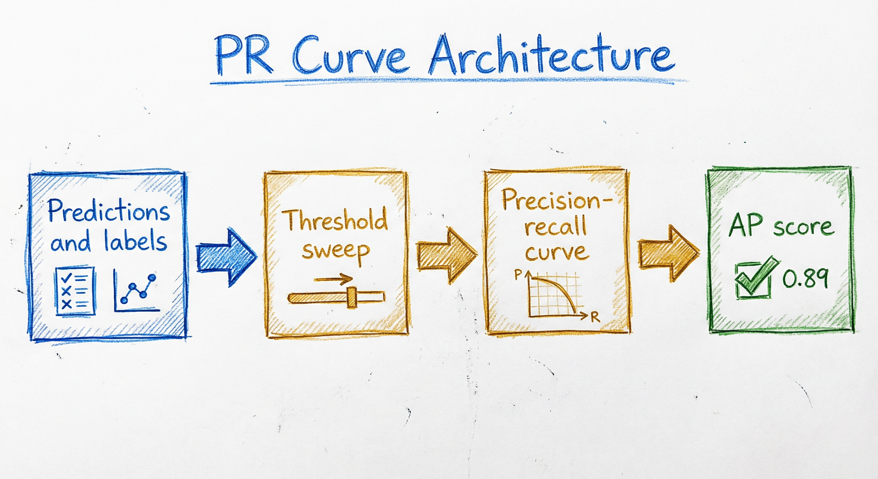
The PR curve computation pipeline is structurally similar to the ROC pipeline but with different metric calculations and important nuances around interpolation. The architecture has four stages: score generation, threshold sweeping with incremental counting, precision-recall computation at each threshold, and area integration with appropriate interpolation.
For production systems, this is typically wrapped inside an evaluation service that computes PR curves alongside ROC curves, confusion matrices, and calibration plots. The PR curve is especially important in the monitoring layer, where shifts in the curve shape signal concept drift or data quality issues affecting the positive class.
Key Components
Score Predictor
Generates predicted probabilities or continuous decision scores for each test sample. For the PR curve to be meaningful, scores must reflect the model's confidence in the positive class. Calibrated probabilities are ideal but not required -- the PR curve evaluates ranking ability, not calibration.
Threshold Sweeper
Sorts predictions in descending order and iterates through all unique score values as candidate thresholds. At each threshold , samples with score are classified as positive. Implementations optimize this by sorting once () and incrementally updating TP and FP counts ( total).
Precision-Recall Calculator
At each threshold, computes Precision = TP / (TP + FP) and Recall = TP / P. Handles the edge case where TP + FP = 0 (no positive predictions) by setting precision to 1.0 (by convention in scikit-learn, since no false positives have been made). This convention ensures the curve starts at (recall=0, precision=1).
Interpolation Engine
Applies the chosen interpolation method to smooth the sawtooth PR curve. The all-point interpolation (monotone envelope) replaces each precision value with the maximum precision at any recall level greater than or equal to the current one. This produces a monotonically non-increasing curve suitable for area computation.
Area Integrator
Computes the Average Precision (AP) by summing over all thresholds. This step-function integration is the standard method in scikit-learn and avoids the over-optimism of trapezoidal integration in PR space.
Threshold Selector (Optional)
Identifies the operating point on the PR curve that maximizes a target metric. Common choices: F1-optimal threshold (maximizes harmonic mean of precision and recall), fixed-recall threshold (e.g., recall >= 0.95 for medical screening), or fixed-precision threshold (e.g., precision >= 0.80 for content moderation). Outputs the threshold value for deployment.
Data Flow
Here's the step-by-step flow:
Step 1: Model predicts scores for all test samples, producing a vector of shape (n,).
Step 2: Predictions are sorted in descending order alongside true labels.
Step 3: For each unique score value (used as threshold), incrementally update TP and FP counts by moving one sample at a time from "predicted negative" to "predicted positive."
Step 4: At each threshold, compute Precision = TP / (TP + FP) and Recall = TP / P.
Step 5: Generate the raw PR curve as a list of (Recall, Precision) pairs.
Step 6: Optionally apply interpolation (all-point monotone envelope) for visualization.
Step 7: Compute Average Precision via step-function integration: AP = sum of (delta_recall * precision) at each threshold.
Step 8: Optionally, identify the threshold maximizing F1 or satisfying a business constraint (e.g., minimum recall).
Modern libraries like scikit-learn's precision_recall_curve() and average_precision_score() handle Steps 2-7 efficiently. The PrecisionRecallDisplay class handles visualization.
A directed flow from trained model through score prediction, descending sort, threshold sweep, precision/recall computation, optional interpolation, curve plotting and AP integration, to final metric reporting and optional threshold selection for deployment.
How to Implement
Computing PR Curves in Practice
The implementation of PR curves is straightforward with modern libraries, but there are critical subtleties that trip up practitioners. The key differences from ROC curve computation are: (1) the interpolation method matters -- trapezoidal integration is not appropriate, (2) the baseline depends on class prevalence, (3) the curve can be non-monotonic before interpolation, and (4) edge cases around zero positive predictions require careful handling.
For production systems, always use sklearn.metrics.precision_recall_curve for the raw curve and sklearn.metrics.average_precision_score for the summary statistic. These implementations handle edge cases correctly and use the appropriate step-function integration (not trapezoidal). For deep learning workflows, torchmetrics.PrecisionRecallCurve and tf.keras.metrics.AUC(curve='PR') provide equivalent functionality with GPU acceleration.
Multi-Class PR Curves
For multi-class problems, PR curves are computed per class using a one-vs-rest (OvR) binarization. Each class gets its own PR curve (that class vs. all others). To aggregate, you have three options:
- Macro-average AP: Average the per-class AP values equally. Treats all classes the same regardless of size.
- Weighted-average AP: Weight each class's AP by its support (number of true instances). Accounts for class frequency.
- Micro-average PR curve: Flatten all class predictions into one binary problem and compute a single PR curve. Dominated by majority classes.
Cost Note: Computing a PR curve on a test set of samples takes time (dominated by sorting). For Flipkart's product classification with M test samples and categories, computing per-class PR curves takes about 15 seconds on a single CPU core. The AP values themselves are computed in after sorting. For bootstrapped confidence intervals (2000 resamples), budget 30-60 seconds. At current AWS rates, that's roughly $0.005 (INR 0.42) per evaluation run on a c5.xlarge instance.
from sklearn.metrics import precision_recall_curve, average_precision_score
from sklearn.metrics import PrecisionRecallDisplay
import numpy as np
import matplotlib.pyplot as plt

# Example: fraud detection with 5% positive rate
np.random.seed(42)
n_samples = 1000
y_true = np.zeros(n_samples, dtype=int)
y_true[:50] = 1  # 50 positives out of 1000 (5% prevalence)
np.random.shuffle(y_true)

# Simulated model scores (higher = more likely positive)
y_scores = np.random.normal(loc=y_true * 2, scale=1)  # Positives shifted right

# Compute PR curve
precision, recall, thresholds = precision_recall_curve(y_true, y_scores)

# Compute Average Precision (AP)
ap = average_precision_score(y_true, y_scores)
print(f"Average Precision (AP): {ap:.3f}")
print(f"Baseline (random): {y_true.mean():.3f}")
print(f"Improvement over random: {ap / y_true.mean():.1f}x")

# Plot PR curve with baseline
fig, ax = plt.subplots(figsize=(8, 6))
disp = PrecisionRecallDisplay(precision=precision, recall=recall,
                               average_precision=ap)
disp.plot(ax=ax, name='Fraud Detection Model', color='darkorange', lw=2)

# Add random baseline
baseline = y_true.mean()
ax.axhline(y=baseline, color='navy', linestyle='--', lw=2,
           label=f'Random baseline (precision = {baseline:.3f})')

ax.set_title('Precision-Recall Curve — Fraud Detection')
ax.legend(loc='upper right')
ax.set_xlim([0.0, 1.05])
ax.set_ylim([0.0, 1.05])
ax.grid(alpha=0.3)
plt.tight_layout()
plt.show()
This is the standard pattern for binary PR curve analysis. Key points: (1) precision_recall_curve() returns precision, recall, and threshold arrays. Note that the precision and recall arrays have one more element than thresholds -- the first point is (recall=0, precision=1) by convention. (2) average_precision_score() computes AP using step-function integration (not trapezoidal). (3) Always plot the random baseline y = prevalence for context. (4) The PrecisionRecallDisplay class provides a clean, publication-ready plot.
from sklearn.metrics import precision_recall_curve, f1_score
import numpy as np

# Compute PR curve
precision, recall, thresholds = precision_recall_curve(y_true, y_scores)

# Compute F1 at each threshold
# Note: precision and recall have len(thresholds) + 1 elements
# The last element corresponds to recall=0, precision=1 (no predictions)
f1_scores = 2 * (precision[:-1] * recall[:-1]) / (precision[:-1] + recall[:-1])

# Handle NaN (when both precision and recall are 0)
f1_scores = np.nan_to_num(f1_scores, nan=0.0)

# Find optimal threshold
optimal_idx = np.argmax(f1_scores)
optimal_threshold = thresholds[optimal_idx]
optimal_precision = precision[optimal_idx]
optimal_recall = recall[optimal_idx]
optimal_f1 = f1_scores[optimal_idx]

print(f"Optimal threshold: {optimal_threshold:.3f}")
print(f"Precision at optimal: {optimal_precision:.3f}")
print(f"Recall at optimal: {optimal_recall:.3f}")
print(f"F1 at optimal: {optimal_f1:.3f}")

# Verify with sklearn
y_pred_optimal = (y_scores >= optimal_threshold).astype(int)
print(f"\nVerification F1: {f1_score(y_true, y_pred_optimal):.3f}")
This finds the threshold that maximizes the F1-score by computing F1 at every point on the PR curve. The F1-optimal threshold is the point tangent to the highest iso-F1 hyperbola in PR space. Important: precision_recall_curve returns arrays where precision and recall have one extra element compared to thresholds, so we use [:-1] to align them. For cost-sensitive applications, replace F1 with F-beta (e.g., F2 for recall-heavy scenarios).
from sklearn.metrics import precision_recall_curve
import numpy as np

def find_threshold_at_min_recall(y_true, y_scores, min_recall=0.95):
    """Find the threshold that achieves at least min_recall with max precision."""
    precision, recall, thresholds = precision_recall_curve(y_true, y_scores)

    # Find all thresholds where recall >= min_recall
    # recall is in decreasing order (high recall at low thresholds)
    valid_mask = recall[:-1] >= min_recall

    if not valid_mask.any():
        print(f"Warning: Cannot achieve recall >= {min_recall}")
        return None, None, None

    # Among valid thresholds, pick the one with highest precision
    valid_precisions = precision[:-1][valid_mask]
    valid_thresholds = thresholds[valid_mask]
    valid_recalls = recall[:-1][valid_mask]

    best_idx = np.argmax(valid_precisions)
    return valid_thresholds[best_idx], valid_precisions[best_idx], valid_recalls[best_idx]

# Example: Medical screening -- must catch 95% of cases
threshold, prec, rec = find_threshold_at_min_recall(y_true, y_scores, min_recall=0.95)
if threshold is not None:
    print(f"Threshold for >= 95% recall: {threshold:.3f}")
    print(f"Precision at this threshold: {prec:.3f}")
    print(f"Actual recall: {rec:.3f}")

# Example: Content moderation -- must have 80% precision
def find_threshold_at_min_precision(y_true, y_scores, min_precision=0.80):
    """Find the threshold that achieves at least min_precision with max recall."""
    precision, recall, thresholds = precision_recall_curve(y_true, y_scores)

    valid_mask = precision[:-1] >= min_precision
    if not valid_mask.any():
        return None, None, None

    valid_recalls = recall[:-1][valid_mask]
    valid_thresholds = thresholds[valid_mask]
    valid_precisions = precision[:-1][valid_mask]

    best_idx = np.argmax(valid_recalls)
    return valid_thresholds[best_idx], valid_precisions[best_idx], valid_recalls[best_idx]

threshold, prec, rec = find_threshold_at_min_precision(y_true, y_scores, min_precision=0.80)
if threshold is not None:
    print(f"\nThreshold for >= 80% precision: {threshold:.3f}")
    print(f"Actual precision: {prec:.3f}")
    print(f"Recall at this threshold: {rec:.3f}")
In production, threshold selection is almost always driven by business constraints, not F1 maximization. Medical screening demands minimum recall (catch 95%+ of cancer cases). Content moderation demands minimum precision (80%+ of flagged content must actually be harmful). Fraud detection at Razorpay might require recall >= 0.90 while keeping precision >= 0.30 to manage the human review queue. This code shows both constraint-driven approaches.
from sklearn.metrics import precision_recall_curve, average_precision_score
from sklearn.preprocessing import label_binarize
import numpy as np
import matplotlib.pyplot as plt

# Example: 4-class text classification (e.g., news categories)
n_classes = 4
class_names = ['Sports', 'Politics', 'Tech', 'Entertainment']
y_true = np.array([0, 1, 2, 3, 0, 1, 2, 3, 0, 0, 0, 1, 2, 3, 0, 1, 2, 0, 3, 2])

# Binarize labels for one-vs-rest
y_true_bin = label_binarize(y_true, classes=range(n_classes))

# Simulated prediction scores (n_samples x n_classes)
np.random.seed(42)
y_scores = np.random.rand(len(y_true), n_classes)
# Make scores roughly correct
for i in range(len(y_true)):
    y_scores[i, y_true[i]] += 1.5
y_scores = y_scores / y_scores.sum(axis=1, keepdims=True)

# Per-class PR curves and AP
precisions = {}
recalls = {}
ap_scores = {}

for i in range(n_classes):
    precisions[i], recalls[i], _ = precision_recall_curve(
        y_true_bin[:, i], y_scores[:, i]
    )
    ap_scores[i] = average_precision_score(y_true_bin[:, i], y_scores[:, i])
    print(f"{class_names[i]:15s} AP: {ap_scores[i]:.3f}")

# Micro-average PR curve (flatten all classes)
precisions['micro'], recalls['micro'], _ = precision_recall_curve(
    y_true_bin.ravel(), y_scores.ravel()
)
ap_scores['micro'] = average_precision_score(
    y_true_bin, y_scores, average='micro'
)
print(f"{'Micro-average':15s} AP: {ap_scores['micro']:.3f}")

# Macro-average AP
ap_macro = np.mean(list(ap_scores[i] for i in range(n_classes)))
print(f"{'Macro-average':15s} AP: {ap_macro:.3f}")

# Plot
fig, ax = plt.subplots(figsize=(10, 7))
colors = ['#e41a1c', '#377eb8', '#4daf4a', '#984ea3']

for i, color in enumerate(colors):
    ax.plot(recalls[i], precisions[i], color=color, lw=1.5,
            label=f'{class_names[i]} (AP = {ap_scores[i]:.2f})')

ax.plot(recalls['micro'], precisions['micro'], color='black', lw=2.5,
        linestyle='--', label=f'Micro-avg (AP = {ap_scores["micro"]:.2f})')

ax.set_xlabel('Recall', fontsize=12)
ax.set_ylabel('Precision', fontsize=12)
ax.set_title('Multi-Class PR Curves (One-vs-Rest)', fontsize=14)
ax.legend(loc='lower left', fontsize=10)
ax.grid(alpha=0.3)
plt.tight_layout()
plt.show()
Multi-class PR curves work by binarizing the problem into K one-vs-rest sub-problems. Each class gets its own PR curve and AP score. The micro-average flattens all predictions into a single binary problem (treating each class prediction independently), while macro-average simply averages the per-class AP scores. For imbalanced multi-class problems, macro-average AP is preferred because it gives equal weight to minority classes. At Flipkart, for example, product classification across 5000+ categories would use macro-AP to ensure rare categories (like luxury watches) are evaluated fairly alongside common ones (like phone cases).
from sklearn.metrics import average_precision_score
from sklearn.utils import resample
import numpy as np

def bootstrap_ap_comparison(y_true, scores_a, scores_b,
                            n_bootstraps=2000, seed=42):
    """Compare two models' AP with bootstrapped confidence intervals."""
    rng = np.random.RandomState(seed)

    ap_a_orig = average_precision_score(y_true, scores_a)
    ap_b_orig = average_precision_score(y_true, scores_b)

    diffs = []
    for _ in range(n_bootstraps):
        indices = rng.randint(0, len(y_true), len(y_true))

        # Skip if bootstrap sample has only one class
        if len(np.unique(y_true[indices])) < 2:
            continue

        ap_a = average_precision_score(y_true[indices], scores_a[indices])
        ap_b = average_precision_score(y_true[indices], scores_b[indices])
        diffs.append(ap_a - ap_b)

    diffs = np.array(diffs)
    ci_lower = np.percentile(diffs, 2.5)
    ci_upper = np.percentile(diffs, 97.5)

    print(f"Model A AP: {ap_a_orig:.4f}")
    print(f"Model B AP: {ap_b_orig:.4f}")
    print(f"AP difference (A - B): {ap_a_orig - ap_b_orig:.4f}")
    print(f"95% CI of difference: [{ci_lower:.4f}, {ci_upper:.4f}]")

    if ci_lower > 0:
        print("Conclusion: Model A is significantly better (p < 0.05)")
    elif ci_upper < 0:
        print("Conclusion: Model B is significantly better (p < 0.05)")
    else:
        print("Conclusion: No significant difference (p >= 0.05)")

    return diffs

# Usage example
np.random.seed(42)
n = 5000
y_true = (np.random.rand(n) < 0.02).astype(int)  # 2% positive rate
scores_a = np.random.normal(loc=y_true * 2.5, scale=1.0)
scores_b = np.random.normal(loc=y_true * 2.0, scale=1.0)

diffs = bootstrap_ap_comparison(y_true, scores_a, scores_b)
When comparing two models, don't just compare AP point estimates -- use bootstrapped confidence intervals to determine if the difference is statistically significant. This is critical in production A/B testing. With 2000 bootstrap resamples on a 5000-sample test set, this takes about 2-3 seconds on a modern CPU. The same approach works for comparing AP before and after model retraining, or between champion and challenger models in a deployment pipeline.
# scikit-learn PR curve and AP configuration examples

# Binary classification
from sklearn.metrics import precision_recall_curve, average_precision_score
precision, recall, thresholds = precision_recall_curve(y_true, y_scores)
ap = average_precision_score(y_true, y_scores)

# Multi-class: micro-averaged
ap_micro = average_precision_score(y_true_bin, y_scores_multi,
                                    average='micro')

# Multi-class: macro-averaged
ap_macro = average_precision_score(y_true_bin, y_scores_multi,
                                    average='macro')

# Multi-class: weighted by class support
ap_weighted = average_precision_score(y_true_bin, y_scores_multi,
                                      average='weighted')

# With sample weights (e.g., cost-sensitive evaluation)
ap = average_precision_score(y_true, y_scores,
                              sample_weight=sample_weights)

# TensorFlow/Keras streaming AP during training
import tensorflow as tf
auc_pr = tf.keras.metrics.AUC(curve='PR', name='pr_auc')

# PyTorch (torchmetrics)
from torchmetrics.classification import BinaryPrecisionRecallCurve
from torchmetrics.classification import BinaryAveragePrecision
metric = BinaryAveragePrecision()
Common Implementation Mistakes
- ●
Using trapezoidal integration for PR-AUC: Unlike ROC space where linear interpolation is valid, the achievable region between two points in PR space is a concave curve, not a straight line. Trapezoidal integration overestimates PR-AUC. Use scikit-learn's
average_precision_score()which uses step-function integration, or apply all-point interpolation before integrating. - ●
Comparing PR-AUC across datasets with different prevalences: AP = 0.30 on a dataset with 1% positives is excellent (30x baseline), while AP = 0.30 on a dataset with 50% positives is terrible (below the 0.50 baseline). Always normalize by the baseline prevalence or only compare within the same dataset.
- ●
Ignoring the starting point convention: scikit-learn's
precision_recall_curvestarts the curve at (recall=0, precision=1.0), reflecting the convention that when no predictions are made, precision is 1.0 (no false positives). Some libraries omit this point, leading to different AP values. Always check your library's convention. - ●
Forgetting that precision is undefined when no positive predictions are made: At very high thresholds, TP + FP = 0. Libraries handle this differently: scikit-learn sets precision = 1.0, other libraries may set it to 0 or NaN. This affects the leftmost point of the PR curve and can impact AP calculations.
- ●
Using
auc(recall, precision)instead ofaverage_precision_score:sklearn.metrics.auc()computes the trapezoidal area, which is overly optimistic for PR curves. Always useaverage_precision_score()for the correct step-function AP. - ●
Not plotting the random baseline: Unlike ROC curves where the diagonal baseline is obvious, PR curves have a baseline at precision = prevalence. Without plotting this horizontal line, stakeholders may misinterpret the PR-AUC value.
When Should You Use This?
Use When
Your dataset has class imbalance (positive class is < 20% of data) and you care about positive-class performance -- the PR curve directly shows how precision degrades as you increase recall
False positives are costly or create operational burden (e.g., human review queues in fraud detection, unnecessary medical procedures in screening) and you need to understand the precision-recall tradeoff at every threshold
You need to select a deployment threshold based on business constraints like minimum recall (medical screening) or minimum precision (content moderation, spam filtering)
You are comparing models for information retrieval, object detection, or search ranking tasks where Average Precision (AP) and Mean Average Precision (mAP) are standard metrics
You want to evaluate model performance honestly on rare events (fraud, rare diseases, anomaly detection) where ROC-AUC can be misleadingly optimistic
You need per-class evaluation in a multi-class setting where some classes are much rarer than others and you want to understand performance on each class independently
Avoid When
Your dataset is roughly balanced (40-60% positive) -- ROC curves and PR curves will tell a similar story, and ROC-AUC has a fixed interpretable baseline of 0.5
You primarily care about the negative class (e.g., verifying that legitimate transactions are approved correctly, where specificity matters more than precision) -- PR curves ignore true negatives entirely
You need a single metric that's comparable across datasets with different class distributions -- PR-AUC's prevalence-dependent baseline makes cross-dataset comparison tricky
Your classifier only outputs hard labels (0/1) without probability scores -- you cannot construct a PR curve from hard labels (you'd get a single point)
You are working with extremely small test sets (< 50 positive examples) where the PR curve will be too noisy to be informative and AP estimates will have high variance
Your evaluation requires cost-sensitive analysis with known dollar values for each error type -- in that case, use cost curves or direct expected cost calculations rather than PR curves
Key Tradeoffs
PR Curves vs. ROC Curves: The Core Tradeoff
This is the central debate in classification evaluation, and the answer is nuanced.
PR curves win when:
- Class imbalance is severe (< 5% positive rate)
- You care specifically about positive-class performance
- False positives have high operational cost (human review queues, unnecessary treatments)
- You need an honest view that doesn't get inflated by true negatives
ROC curves win when:
- Classes are roughly balanced
- You care about both positive and negative class performance
- You need a cross-dataset-comparable metric (ROC-AUC = 0.5 is always random)
- You want to evaluate discrimination ability in a threshold-agnostic way
The 2024 counterpoint: Richardson et al. (2024, Patterns) showed that ROC curves are actually robust to class imbalance, while PR curves are highly sensitive to it. Their argument: PR-AUC's prevalence-dependent baseline makes it harder to normalize and compare, not easier. This is a valid point for cross-dataset comparison, but within a single dataset, PR curves remain more informative for positive-class-centric evaluation.
Interpolation Method Tradeoffs
| Method | Pros | Cons |
|---|---|---|
| Step-function (sklearn default) | Correct, no over-estimation | Slightly pessimistic |
| All-point interpolation | Smooth, standard in IR/object detection | Can mask performance dips |
| 11-point interpolation | Simple, historical precedent | Low resolution, deprecated |
| Trapezoidal | Familiar from ROC analysis | Over-optimistic -- do not use |
Single Metric vs. Full Curve
Average Precision compresses the entire curve into one number, which is convenient for leaderboards and automated model selection. But two models with the same AP can have very different curve shapes -- one might have high precision at low recall (good for conservative deployment), while the other has moderate precision across all recall levels (better for high-recall applications). Always examine the full curve for production decisions.
Practical Rule: Use PR-AUC (Average Precision) for automated model selection in imbalanced settings. Plot the full PR curve for threshold selection and stakeholder communication. Report both PR-AUC and ROC-AUC -- they complement each other.
Alternatives & Comparisons
The ROC curve plots TPR vs FPR and is the PR curve's direct counterpart. ROC-AUC has a fixed baseline (0.5 for random), making cross-dataset comparison straightforward, and it evaluates both positive and negative class performance. However, on imbalanced datasets, ROC-AUC can be misleadingly high because FPR is diluted by the large number of true negatives. Use ROC-AUC for balanced data or when you need a dataset-independent metric; use PR curves when the positive class is rare and important.
Precision, recall, and F1 are threshold-specific metrics computed at a single operating point, while the PR curve shows these values across all thresholds. The PR curve is strictly more informative -- it contains the F1-optimal point as well as every other precision-recall tradeoff. Use standalone precision/recall/F1 for production monitoring at your chosen threshold; use PR curves for model selection and threshold optimization.
The confusion matrix provides raw TP/FP/TN/FN counts at a single threshold. It's the building block from which each point on the PR curve is derived. The confusion matrix gives granular error analysis (which specific errors are being made), while the PR curve gives a holistic view across all thresholds. Use confusion matrices for error analysis at your deployment threshold; use PR curves for model comparison and threshold selection.
Accuracy = (TP+TN)/(TP+FP+TN+FN) is the metric that PR curves were essentially created to replace in imbalanced settings. Accuracy is dominated by the majority class and can be trivially maximized by predicting the majority class for everything. PR curves focus exclusively on positive-class performance and are immune to majority-class inflation. Never use accuracy alone for imbalanced classification -- always supplement with PR curves or PR-AUC.
Pros, Cons & Tradeoffs
Advantages
Focuses exclusively on positive-class performance, making it immune to the true-negative dilution that inflates ROC-AUC on imbalanced datasets. Every point on the curve tells you about precision and recall -- no TN contamination.
Provides an honest view of false positive burden through precision (TP / (TP + FP)), directly showing the fraction of positive predictions that are correct. This maps directly to operational metrics like review queue accuracy in fraud detection.
Enables principled threshold selection for business constraints. You can read off the precision at any target recall level (e.g., 95% recall for medical screening) or vice versa, making deployment decisions transparent.
Average Precision (AP) baseline reflects problem difficulty: unlike ROC-AUC's fixed 0.5 baseline, PR-AUC baseline equals the positive prevalence, making improvement over random clearly visible and proportional to the class imbalance.
Standard metric in information retrieval and object detection (as mAP), meaning a vast ecosystem of tools, benchmarks, and best practices exists. Researchers and practitioners share a common language.
Sawtooth pattern reveals model behavior at individual thresholds, showing where the model struggles (precision drops sharply) and where it's confident (precision remains high). This granularity is invisible in smooth ROC curves.
Supports multi-class evaluation via per-class PR curves and macro/micro/weighted AP averaging, giving detailed per-class insights that aggregate metrics hide.
Disadvantages
Prevalence-dependent baseline makes cross-dataset comparison difficult. AP = 0.30 means very different things on datasets with 1% vs. 50% positive rates. Normalizing PR-AUC for prevalence is non-trivial.
Ignores true negatives entirely, which matters in applications where negative-class performance is important (e.g., ensuring legitimate transactions are approved without friction).
Sensitive to the number of positive samples: with few positives (< 50), the PR curve is extremely noisy, and small changes in predictions cause large jumps in precision. AP estimates have high variance on small datasets.
Interpolation method significantly affects the computed AP: trapezoidal integration overestimates, step-function is slightly pessimistic, all-point interpolation smooths differently. Different libraries use different defaults, making comparisons error-prone.
No universally agreed-upon statistical test for comparing two PR curves (unlike DeLong's test for ROC curves). Bootstrap confidence intervals are the practical standard but lack the theoretical elegance of DeLong's method.
Non-monotonic raw curves (sawtooth pattern) can confuse stakeholders unfamiliar with PR analysis. The zigzag requires explanation and typically interpolation before presentation.
Failure Modes & Debugging
Over-Optimistic AP from Trapezoidal Integration
Cause
Using sklearn.metrics.auc(recall, precision) or any trapezoidal integration method instead of average_precision_score(). In PR space, the achievable region between two operating points is concave (not linear), so linear interpolation between consecutive PR points overestimates the true area.
Symptoms
AP is 5-15% higher than the correct value. Model appears significantly better than it actually is. Deployed model underperforms relative to offline evaluation. Comparisons between models are inconsistent with real-world performance rankings.
Mitigation
Always use sklearn.metrics.average_precision_score() for AP computation. This uses step-function integration (summing rectangles, not trapezoids). If you need a smooth curve for visualization, apply all-point interpolation (precision_interp = np.maximum.accumulate(precision[::-1])[::-1]) separately from the AP calculation.
Misleading AP Comparison Across Datasets with Different Prevalences
Cause
Comparing AP values from datasets with different positive class rates without accounting for the prevalence-dependent baseline. A model with AP = 0.20 on a 0.5% prevalence dataset (40x improvement over random) is compared unfavorably with AP = 0.40 on a 30% prevalence dataset (1.3x improvement over random).
Symptoms
Wrong model is selected for deployment. Teams working on harder problems (rarer positives) appear to have worse models despite superior relative performance. Resource allocation decisions favor easier classification tasks.
Mitigation
Report AP alongside the baseline prevalence. Consider reporting the AP lift ratio: AP / prevalence. Alternatively, use standardized metrics like the normalized PR-AUC proposed by Boyd et al. (2013). Within the same dataset, AP comparison is always valid.
Noisy PR Curve Due to Small Positive Sample Size
Cause
Evaluating on a test set with fewer than 50-100 positive instances. Each true positive or false positive causes a large jump in precision (because TP and FP counts are small), creating an extremely jagged curve with high variance.
Symptoms
PR curve looks like random noise rather than a smooth tradeoff. AP estimate changes dramatically with small perturbations to the test set. Bootstrap confidence intervals are very wide (e.g., AP = 0.45 with 95% CI [0.20, 0.70]). Threshold selection from the curve is unreliable.
Mitigation
Ensure at least 100 positive examples in the test set for stable AP estimates. Use stratified sampling to preserve class ratios. Report bootstrap 95% CIs alongside AP. For very rare events, consider cross-validation-based AP estimation or pooling predictions across validation folds before computing the PR curve.
Threshold Drift Between Evaluation and Production
Cause
Selecting a threshold from the PR curve on validation data, then deploying it to production where the score distribution or class prevalence has shifted. The selected threshold no longer corresponds to the same precision-recall operating point.
Symptoms
Production precision is much lower than expected (more false positives than planned). Or production recall is lower than expected (missing more positives). The deployed model's actual operating point is far from the intended point on the validation PR curve.
Mitigation
Monitor production precision and recall at the deployed threshold continuously. Implement score distribution monitoring (KL divergence or PSI between training and production score distributions). Re-evaluate the PR curve monthly or after significant data distribution changes. Consider adaptive thresholding that adjusts based on recent production statistics.
Multi-Class AP Dominated by Majority Classes (Micro-Average Trap)
Cause
Using micro-averaged AP for a multi-class problem with severe class imbalance. Micro-averaging flattens all class predictions into one binary problem, where majority classes contribute disproportionately more samples.
Symptoms
Overall micro-AP looks good (0.85+) but minority classes have terrible AP (0.10-0.20). Product team doesn't realize the model fails on rare but important categories. For example, a product classifier at Flipkart might excel on phones and clothing (millions of samples) but fail on premium watches or specialty foods (hundreds of samples).
Mitigation
Always report per-class AP alongside any aggregate. Use macro-averaged AP for imbalanced multi-class problems (it weights all classes equally). Report the worst-class AP as a "floor" metric. Consider class-specific thresholds for deployment rather than a single global threshold.
Placement in an ML System
Where Does the PR Curve Fit in the ML Pipeline?
The PR curve lives in the evaluation and threshold selection phase, after model training but before deployment. Here's the typical integration:
During Model Development: Train multiple candidate models. Compute AP on the validation set for each. Use AP (not ROC-AUC) as the primary metric for model selection when the problem is imbalanced. Plot PR curves to compare curve shapes, not just AP values.
Threshold Selection: After selecting the best model, use the PR curve to choose a deployment threshold. This is where business constraints enter: minimum recall for safety-critical applications (cancer screening at Narayana Health requires recall >= 0.95), minimum precision for operational efficiency (Swiggy's fraud alerts need precision >= 0.30 to keep the review queue manageable).
A/B Testing: Deploy the model alongside the incumbent. Compute AP on live traffic (with delayed ground truth labels). Use bootstrap CIs to determine if the new model is statistically significantly better.
Production Monitoring: Continuously track precision and recall at the deployed threshold. Plot weekly PR curves on recent data (last 7 days) to detect drift. Alert when precision drops below the minimum threshold or recall drops below the safety floor.
Retraining Triggers: If the production PR curve degrades significantly compared to the training-time PR curve (quantified by AP drop > 0.05), trigger model retraining with fresh data.
Key Insight: The PR curve isn't just an evaluation metric -- it's the operational bridge between model quality and business constraints. The threshold you select from the PR curve becomes a deployment configuration parameter, and monitoring precision/recall at that threshold is your ongoing quality assurance.
Pipeline Stage
Evaluation / Validation
Upstream
- confusion-matrix
- precision-recall-f1
Downstream
- roc-auc
- model-selection
- threshold-optimization
Scaling Bottlenecks
For a single model on a test set of samples, computing the PR curve and AP is due to sorting, with for the actual precision-recall computation and AP integration. This is typically negligible:
- K: ~5ms
- M: ~500ms
- M: ~50 seconds
Bottlenecks emerge in three scenarios:
1. Bootstrap Confidence Intervals: 2000 resamples each require re-sorting and AP computation. For K, expect 10-20 seconds on a single CPU core. Parallelize across cores (embarrassingly parallel) to cut to 2-3 seconds.
2. Multi-Class with Many Classes: Per-class PR curves for classes requires separate computations. For Flipkart's 5000+ product categories with M test samples, that's 5000 curve computations taking ~40 minutes sequentially. Parallelize across classes.
3. Hyperparameter Search: Grid search over 200 configurations with 5-fold CV means 1000 AP computations. For K per fold, that's 1000 * 250ms = 250 seconds. Acceptable, but use early stopping on AP as the monitored metric rather than computing full PR curves at every step.
Memory: The PR curve stores precision-recall-threshold triplets. For M, that's ~240MB at float64. For visualization, downsample to ~10K points.
Production Case Studies
The COCO (Common Objects in Context) object detection challenge, which Google helped establish and which serves as the primary benchmark for object detection models worldwide, uses Average Precision (AP) as its primary evaluation metric. Specifically, COCO computes AP at multiple IoU thresholds (0.50 to 0.95 in steps of 0.05) and averages them. The mean Average Precision (mAP) across all 80 object categories is the headline metric. This is the PR curve's most prominent application: every major object detection model (YOLO, Faster R-CNN, DETR, DINOv2) is ranked by mAP, making PR-based evaluation the standard in computer vision.
The COCO mAP metric has driven years of progress in object detection. State-of-the-art models have improved from mAP ~37 (2016, Faster R-CNN) to mAP ~63+ (2025, latest models). The PR-based evaluation ensures models are penalized for false detections and rewarded for finding all objects, making mAP a balanced and informative metric that the entire computer vision community trusts.
PayPal processes billions of transactions annually with fraud rates well below 1%. Their fraud detection ML pipeline relies heavily on precision-recall analysis because ROC-AUC alone doesn't capture the false positive burden on their review teams. The PR curve helps them set thresholds that balance catching fraud (recall) with minimizing false blocks on legitimate transactions (precision). A decrease in precision from 40% to 30% at their operating threshold means 33% more false alarms for the same number of true catches, translating directly to increased operational cost and customer friction.
By using PR curve analysis for threshold selection, fraud detection teams at PayPal-scale companies can maintain recall above 90% while keeping precision high enough that human review queues remain manageable. For a system processing 100 million transactions/day in India at average transaction value INR 2,500, a 1% improvement in precision at fixed recall saves approximately INR 25 lakh/day (USD ~$3,000/day) in reduced false positive investigation costs.
Medical screening applications in India, including cancer detection systems deployed at hospital chains like Narayana Health and Apollo Hospitals, face extreme class imbalance (typically 1-5% positive rates for screening tests). Ozenne et al. (2015) demonstrated in the Journal of Clinical Epidemiology that for rare diseases with 1% prevalence, ROC-AUC exceeded 0.9 while PR-AUC was below 0.2 -- a massive discrepancy that would mislead clinicians into thinking the test was highly effective. PR curves are now standard in clinical ML evaluation for revealing the true positive predictive value (precision) at various sensitivity (recall) levels, directly informing the clinical decision about which threshold to deploy.
For a diabetes screening model at an Indian hospital processing 10,000 patients/month with 5% diabetes prevalence (500 true positives), a threshold selected from the PR curve at recall=0.95 and precision=0.40 means: 475 diabetics caught, 25 missed, and ~713 false positives. At INR 1,500/follow-up test, false positives cost INR 10.7 lakh/month ($12,750). The PR curve makes this cost-recall tradeoff explicit, enabling evidence-based threshold selection. Without it, clinicians might set thresholds based on ROC analysis that looks great but hides the false positive burden.
Indian social media platform ShareChat (with 180M+ monthly active users) uses ML-based content moderation to detect harmful content including hate speech, misinformation, and graphic violence. With harmful content representing < 2% of all posts, this is a severe imbalance problem. PR curves guide their threshold selection because the cost of false positives (removing safe content, suppressing free speech) and false negatives (allowing harmful content through) are both significant. Different content categories (violence, hate speech, nudity) have different precision-recall requirements based on regulatory and user safety considerations.
Content moderation teams use per-category PR curves to set category-specific thresholds. Violence detection might operate at recall=0.98 with lower precision (aggressive removal), while borderline political content operates at precision=0.90 with lower recall (conservative removal to avoid censorship accusations). This nuanced, PR-curve-driven approach handles the diverse content safety requirements across India's many languages and cultural contexts.
Tooling & Ecosystem
The standard library for PR curves in Python. Provides precision_recall_curve() for computing the curve, average_precision_score() for AP with correct step-function integration, and PrecisionRecallDisplay for publication-quality plots. Supports binary and multi-class (via label binarization) settings. Handles edge cases (no positive predictions, single-class samples) correctly.
BinaryPrecisionRecallCurve, MulticlassPrecisionRecallCurve, and BinaryAveragePrecision provide GPU-accelerated PR curve computation for PyTorch models. Integrates seamlessly with PyTorch Lightning for automatic metric logging. Supports distributed computation across multiple GPUs for large-scale evaluation.
tf.keras.metrics.AUC(curve='PR') computes PR-AUC as a streaming metric during training, enabling real-time monitoring of average precision across epochs. The num_thresholds parameter controls approximation granularity (default 200). Useful for early stopping based on PR-AUC rather than loss.
Visual ML diagnostics library built on scikit-learn. The PrecisionRecallCurve visualizer creates annotated PR curve plots with iso-F1 curves, per-class curves for multi-class problems, and micro/macro averaging. One-line API for publication-ready plots: visualizer = PrecisionRecallCurve(model); visualizer.fit(X_train, y_train); visualizer.score(X_test, y_test); visualizer.show().
MLflow automatically logs PR curves and AP scores when using its autologging feature with scikit-learn, TensorFlow, and PyTorch. The mlflow.log_figure() API stores PR curve plots as artifacts for each experiment run, enabling visual comparison across experiments. Essential for production ML teams tracking model performance over time.
Dedicated R package for computing PR and ROC curves with correct interpolation. Implements the Davis-Goadrich (2006) algorithm for computing the achievable PR curve. Provides both the PR-AUC with appropriate integration and minmax-optimal curves. Particularly popular in bioinformatics and clinical research where R is the standard.
Research & References
Davis, J. & Goadrich, M. (2006)ICML 2006
Landmark paper proving that a curve dominates in ROC space if and only if it dominates in PR space. Introduced the concept of the achievable PR curve (analogous to the convex hull in ROC space) and an efficient algorithm for computing it. Established the mathematical foundation for comparing PR and ROC evaluations.
Saito, T. & Rehmsmeier, M. (2015)PLOS ONE
Influential paper demonstrating that ROC plots provide an overly optimistic view of classifier performance on imbalanced data, while PR plots offer accurate assessment. Showed through simulation that high ROC-AUC can coexist with low PR-AUC when class imbalance is severe. Over 1500 citations, establishing PR curves as the standard for imbalanced classification evaluation.
Boyd, K., Eng, K.H. & Page, C.D. (2013)ECML PKDD 2013
Performed a rigorous computational analysis of common AUCPR estimators and their confidence intervals. Found that some common procedures produce invalid estimates. Recommended two robust interval estimation methods for PR-AUC, providing the statistical foundation for reliable model comparison using AP.
Ozenne, B., Subtil, F. & Maucort-Boulch, D. (2015)Journal of Clinical Epidemiology
Demonstrated in a clinical setting that for rare diseases (1% prevalence), ROC-AUC exceeded 0.9 while PR-AUC was below 0.2 -- a dramatic discrepancy. Showed that PR curves provide honest assessment of biomarker performance in rare disease settings where clinicians need accurate positive predictive value estimates.
Richardson, Trevizani, Greenbaum, Carter, Nielsen & Peters (2024)Patterns (Cell Press)
Challenges the Saito & Rehmsmeier (2015) consensus by showing that ROC curves are actually robust to class imbalance while PR curves are highly sensitive to it. Argues that PR-AUC's prevalence-dependent baseline makes normalization and cross-dataset comparison difficult. Important counterpoint that advocates using both ROC and PR curves together.
Interview & Evaluation Perspective
Common Interview Questions
- ●
When would you use a PR curve instead of a ROC curve? Give a specific example from your experience.
- ●
Explain what Average Precision (AP) measures. How is it different from the area under the ROC curve?
- ●
Your fraud detection model has ROC-AUC = 0.95 but Average Precision = 0.15. Is this a good model? Why or why not?
- ●
How do you select an operating threshold from a PR curve for a medical screening application?
- ●
What's the baseline PR-AUC for a random classifier? How does it depend on the dataset?
- ●
Why is trapezoidal integration inappropriate for computing PR-AUC, and what should you use instead?
- ●
Walk me through how you'd compute multi-class mAP for an object detection model.
- ●
Two teams present models with the same AP but different PR curve shapes. How do you decide which to deploy?
Key Points to Mention
- ●
PR curves focus on positive-class performance by plotting precision (TP / (TP + FP)) vs recall (TP / (TP + FN)). No true negatives appear anywhere in these metrics, making PR curves immune to the dilution effect that plagues ROC curves on imbalanced data.
- ●
Average Precision is the area under the step-function PR curve, computed as the weighted sum of precisions at each recall level. It's NOT the trapezoidal area -- using trapezoidal integration overestimates AP by 5-15%.
- ●
The PR curve baseline depends on class prevalence: random AP approximately equals the positive rate. This makes AP = 0.20 on a 1% positive dataset excellent (20x baseline) but AP = 0.20 on a balanced dataset terrible.
- ●
For threshold selection, business constraints drive the decision: medical screening prioritizes minimum recall (catch 95% of cases), fraud detection balances precision and recall, content moderation prioritizes precision (avoid censoring legitimate content).
- ●
Davis and Goadrich (2006) proved that ROC and PR spaces are mathematically equivalent for dominance relationships, but the visual interpretability differs dramatically under imbalance.
- ●
In object detection, mAP (mean Average Precision) across categories and IoU thresholds is the universal standard (COCO, PASCAL VOC). Understanding how mAP decomposes into per-class AP is essential.
Pitfalls to Avoid
- ●
Saying PR curves are 'better' than ROC curves without nuance. They serve different purposes: PR for positive-class-centric evaluation on imbalanced data, ROC for balanced evaluation with a dataset-independent baseline. Senior candidates know to use both.
- ●
Confusing average precision (AP) with mean average precision (mAP). AP is for a single class/query; mAP averages AP across multiple classes or queries. This distinction matters in object detection and information retrieval.
- ●
Claiming that AP directly tells you how good your model is without referencing the baseline prevalence. AP = 0.30 means nothing without knowing whether the baseline is 0.01 (excellent) or 0.50 (poor).
- ●
Using
auc(recall, precision)instead ofaverage_precision_score()and reporting over-optimistic numbers. This is a common bug that experienced interviewers will catch. - ●
Ignoring the sawtooth nature of raw PR curves and presenting them to stakeholders without interpolation, causing confusion about the apparent non-monotonicity.
Senior-Level Expectation
A senior candidate should articulate the mathematical relationship between PR and ROC spaces (Davis-Goadrich theorem), explain the prevalence-dependent baseline and why cross-dataset AP comparison requires normalization, and discuss interpolation methods (step-function vs. trapezoidal vs. all-point) with awareness that trapezoidal is incorrect for PR space. They should be able to design a threshold selection pipeline that maps business constraints (minimum recall for medical screening, maximum false positive rate for fraud operations) to specific points on the PR curve and implements monitoring to detect threshold drift. They should compare micro vs. macro AP for multi-class problems and explain when each is appropriate. For production systems, they should discuss how to handle delayed ground truth labels (common in fraud detection where chargebacks arrive weeks later) and how this affects PR curve computation and monitoring. A concrete example: 'For a UPI fraud detection system at PhonePe processing 10 billion transactions/month with 0.05% fraud rate, I'd select a threshold from the PR curve at recall >= 0.92 and precision >= 0.25, which gives us 4 false alarms per true fraud -- manageable for a 200-person review team. The AP at 0.35 compared to baseline 0.0005 represents a 700x improvement. I'd monitor weekly PR curves and alert if AP drops below 0.30, triggering retraining.' This kind of end-to-end reasoning with INR-denominated business impact is what distinguishes senior from mid-level candidates.
Summary
The Precision-Recall (PR) curve is the essential evaluation tool for classification problems with class imbalance -- which, in practice, means most real-world ML systems. By plotting precision (y-axis) against recall (x-axis) across all classification thresholds, it provides an honest, unvarnished view of how well your model identifies the positive class, free from the true-negative dilution that can make ROC curves misleadingly optimistic.
The Average Precision (AP), the standard summary scalar for the PR curve, is computed as the area under the step-function PR curve: . Unlike ROC-AUC's fixed 0.5 baseline, AP's baseline equals the positive class prevalence, making improvements directly proportional to problem difficulty. AP = 0.20 on a 1% positive dataset (20x baseline) is excellent; AP = 0.20 on a balanced dataset is poor. This prevalence-dependent baseline is both the PR curve's greatest strength (honest evaluation) and its primary limitation (cross-dataset comparison is non-trivial).
In production, the PR curve serves two critical functions beyond model comparison. First, threshold selection: business constraints like minimum recall (medical screening) or minimum precision (content moderation) map directly to points on the PR curve, making the deployment threshold a principled, data-driven choice rather than a guess. Second, monitoring: tracking the PR curve shape and AP over time reveals concept drift and data quality issues affecting the positive class, often before aggregate metrics like accuracy show any degradation.
Key technical points to remember: (1) Never use trapezoidal integration for PR-AUC -- it overestimates by 5-15%. Use sklearn.metrics.average_precision_score(). (2) The sawtooth pattern is expected, not a bug. Apply all-point interpolation for visualization only. (3) Davis and Goadrich (2006) proved ROC and PR dominance are equivalent, but visual interpretability differs dramatically under imbalance. (4) For multi-class problems, use macro-averaged AP to give equal weight to minority classes. (5) Always plot the random baseline (horizontal line at precision = prevalence) for context. (6) Bootstrap confidence intervals are the standard for statistical comparison, as no DeLong-equivalent test exists for PR curves.
Whether you're evaluating fraud detection at Razorpay, cancer screening at Narayana Health, object detection at COCO, or content moderation at ShareChat, the PR curve is your most trustworthy tool for understanding positive-class performance. Master it, and you'll make better model selection decisions, choose better deployment thresholds, and build more honest evaluation pipelines.